Customizing Form Templates
You can customize Form Templates to include the exact categories, components, fields, and field options you need for any type of inspection. Once saved, your customized Form Templates are available for reuse across multiple inspections, saving time and improving report consistency.
See the Inspection Form framework documentation for a detailed explanation on categories, components, fields, and field options.
Types of customizations
Customizations include:
- Custom categories – Group components however you want.
- Custom components – Add new inspection items or rename existing ones.
- Custom fields – Create new fields.
- Custom field options – Add or edit the field options.
- Required/Optional fields – Choose which fields must be filled out.
- Visibility – Hide fields from the final report.
- Edit field names – Rename fields to suit your wording.
- Edit field options – Change placeholder or default text for clarity.
- Edit disclaimers and limitations – Change placeholder or default text for clarity.
You have full control over how your Form Templates look and behave — without needing to code.
Creating, editing, and deleting categories
The sections below cover creating, editing, and deleting categories.
Creating categories
To create new categories:
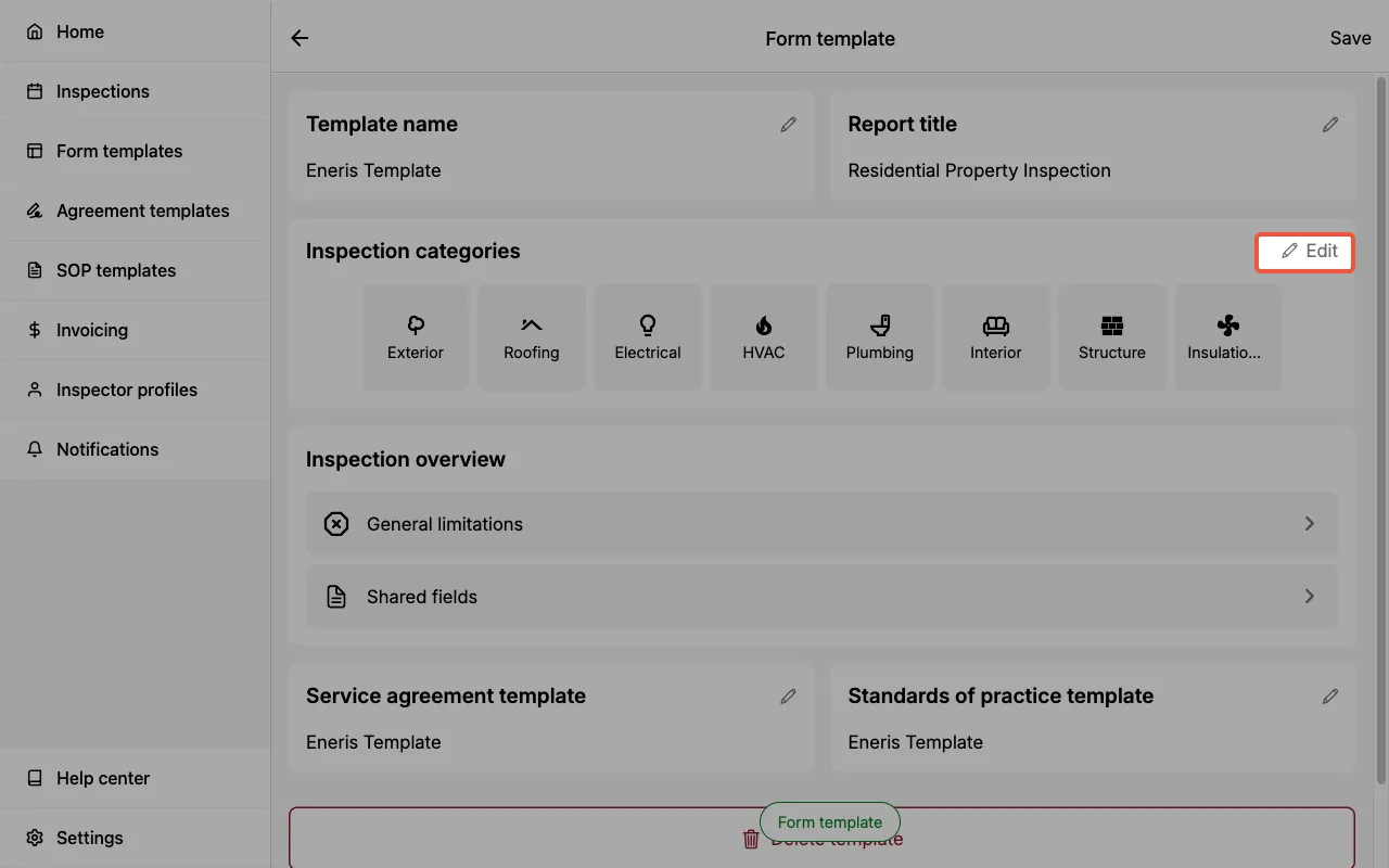
- Open the Form Template you would like to edit.
- Select the edit icon in the
Categoriessection. - In the Add new category section, enter a
category name. - Select a
category icon. - Choose
Create blank categoryorCreate from existing category. - Select
Create new category.
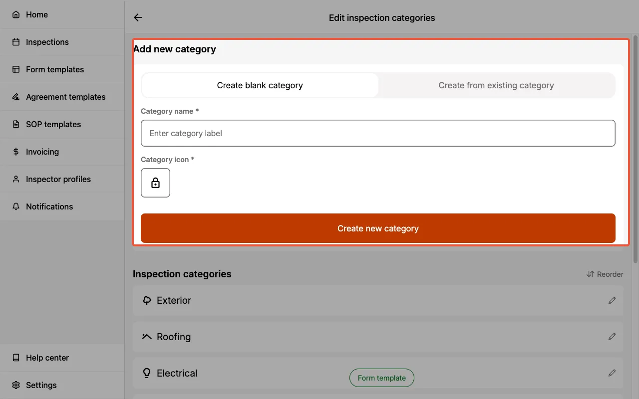
Create blank categorymeans there are no components within the new category.Create from existing categorymeans you can select an existing category and duplicate all of the components, fields, and field options within as a starting point. You can then further customize this duplicated category to suit your needs.
Editing categories
To edit existing categories:
- Open the Form Template you would like to edit.
- Select the edit icon in the
Categoriessection.
- Select the edit icon next to the category you would like to edit.
- Edit the
category nameandcategory iconas desired. - Select
Save.
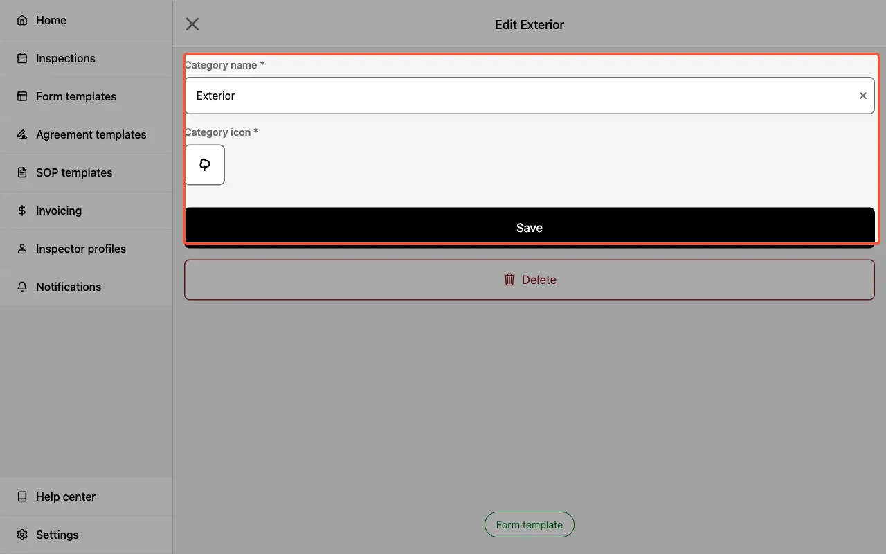
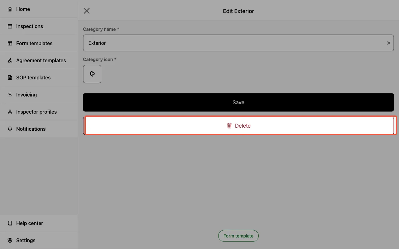
Deleting categories
To delete existing categories:
- Select the edit icon in the
Categoriessection. - Select the edit icon next to the category you would like to delete.
- Select the
Deletebutton.
Creating, editing, and deleting components
The sections below cover creating, editing, and deleting components.
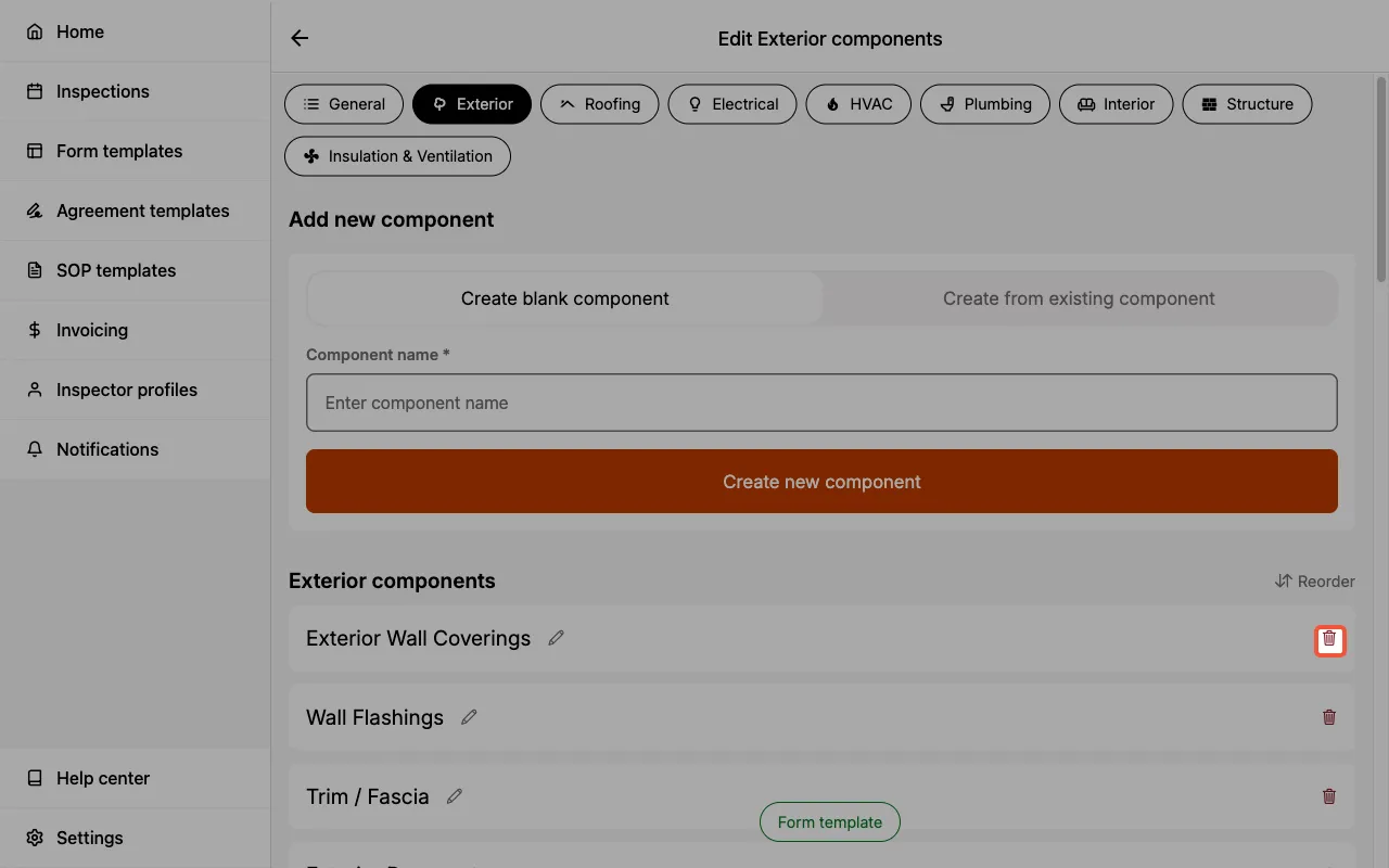
Creating components
To create new components:
- Enter the category in which the new component should be created.
- Select
Edit components.
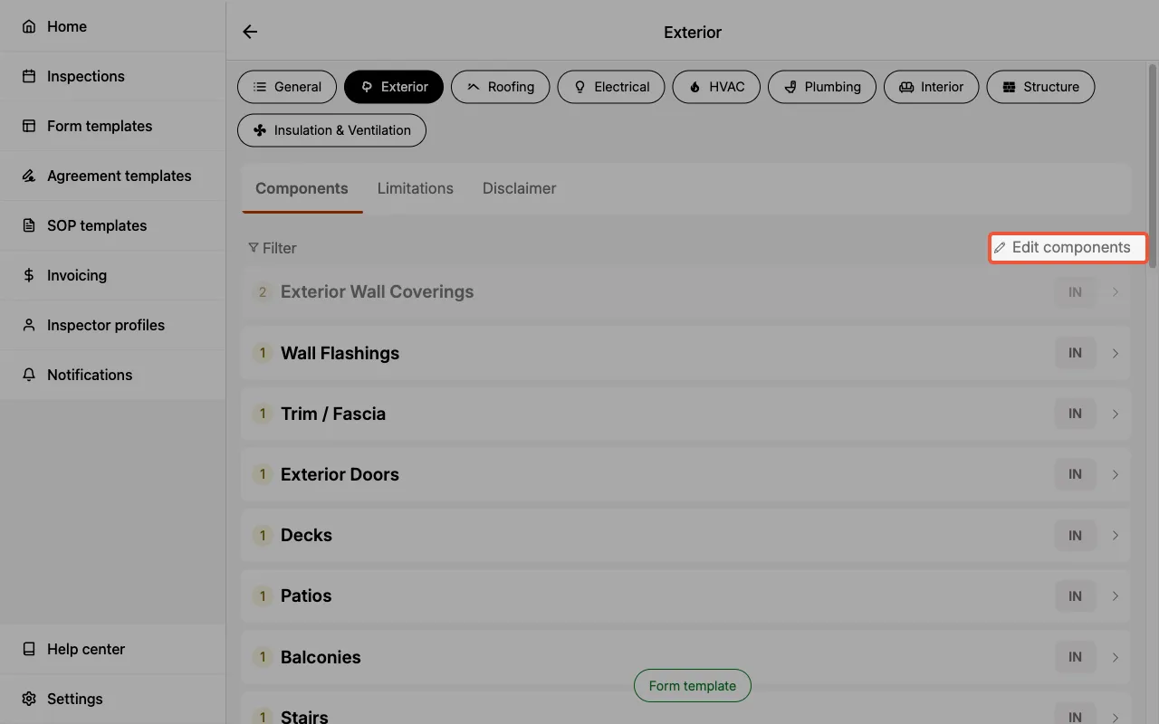
- In the Add new component section, enter the new component name.
- Choose
Create blank componentorCreate from existing component. - Select
Create new component. - The new component has been successfully created and can be located at the bottom of the component list.
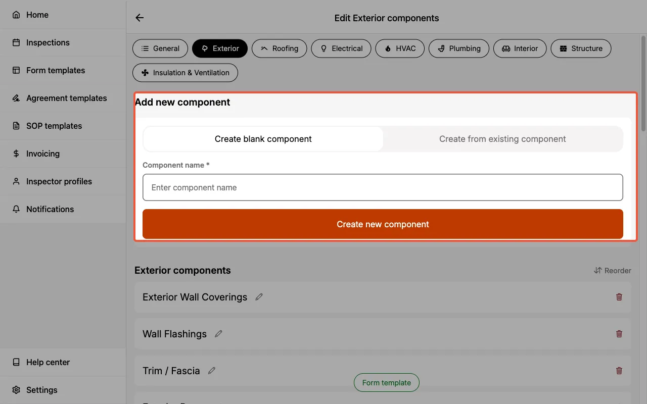
Create blank componentmeans there are no fields within the new component.Create from existing componentmeans you can select an existing component and duplicate all of the fields and field options within as a starting point. You can then further customize this duplicated component to suit your needs.
Editing components
To edit existing components:
- Enter the category containing the component you would like to edit.
- Select
Edit components. - Select the pencil icon next to the component you would like to edit.

- Update the
Component nameat the top of the page.
Deleting components
To delete existing components:
- Enter the category in which the component should be deleted.
- Select
Edit components. - Locate the component you would like to delete and select the trash icon next to it.
Creating, editing, and deleting fields
The sections below cover creating, editing, and deleting fields.
Creating fields
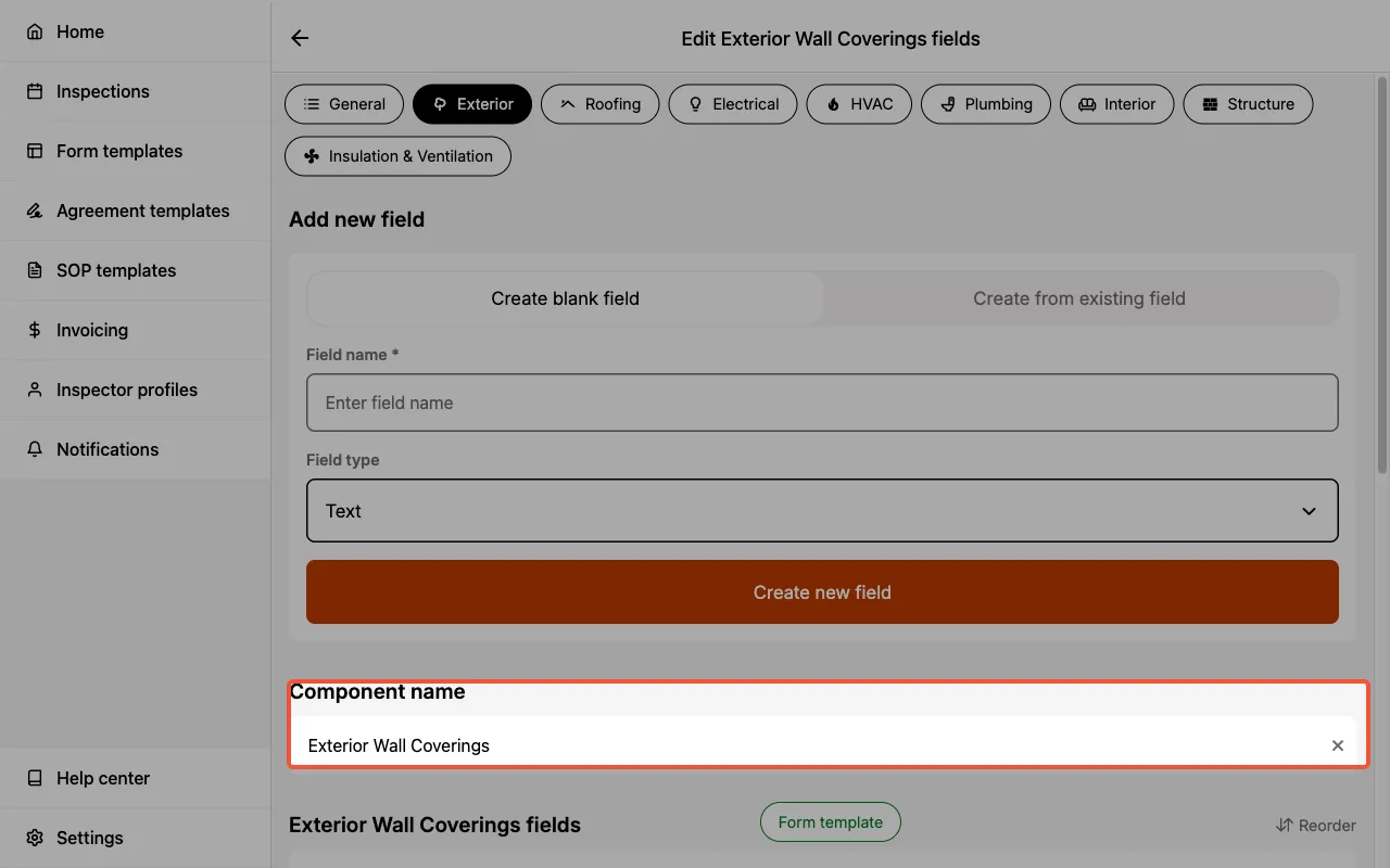
To create new fields:
- Enter the category containing the component where the new field should be created.
- Select
Edit components. - Select the pencil icon next to the component where the new field should be created.
- In the Add new field section, enter a
field name. - Select the
field type. - Select
Create new field. - The new field has been successfully created and can be located at the bottom of the field list.
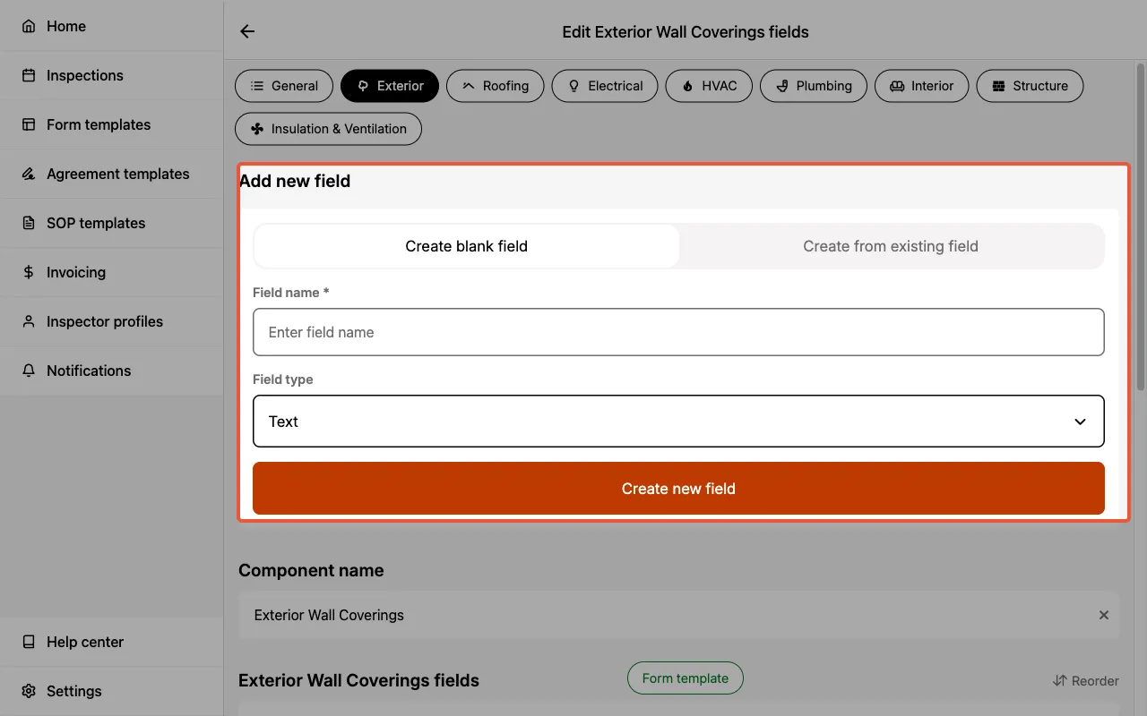
Field types
You can use different types of fields in your Form Templates:
- Checkbox – Creates checkboxes for you to select one or more options.
- Choice – Creates radio buttons for you to select a single option.
- Text – For short text descriptions (50 characters max).
- Multi-line Text – For longer text descriptions (1,000 characters max).
- Media – For capturing photos and videos with saved captions.
Each field type lets you capture different types of data for better clarity in your reports.
You can create many fields of the same field type in an individual component.
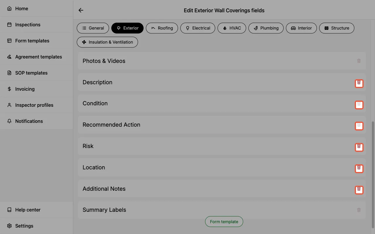
Editing fields
To edit existing fields:
- Enter the category containing the component with the field to be edited.
- Select the component to expand it, revealing the fields and their edit icons.
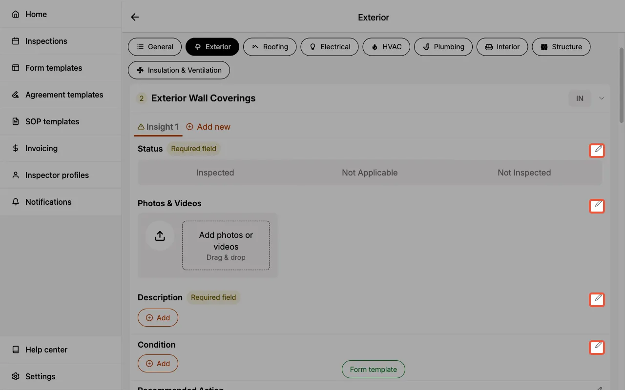
- Select the edit icon next to the field that should be edited.
- Edit the
field name,field requirement,field visibility,favorite optionsandoption library, as desired.
See additional field settings for more details.
Deleting fields
To delete existing fields:
- Enter the category containing the component where the field should be deleted.
- Select
Edit components.
- Select the pencil icon next to the component containing the field to be deleted.
- Locate the field you would like to delete and select the trash icon next to it.
Creating, editing, and deleting field options
The sections below cover creating, editing, and deleting field options.
Creating field options
To create new field options:
- Enter the component where you would like to create new field options.
- Each field will have a
+ Addbutton. Selecting it will allow you to add a new field option.
Editing field options
To edit existing field options:
- Enter the component where you would like to edit field options.
- Select the edit icon next to the field which contains the field options that should be edited.
- Review and edit the
favorite optionsandoption library.
Deleting field options
The method to deleting existing field options is determined by the field type.
- Checkbox
- Choice
- Text
- Multi-line text
- Media
- Enter the component where you would like to delete checkbox options.
- Select the edit icon next to the field which contains the checkbox options that should be deleted.
- Locate the list of checkbox options in the option library.
- Select the trash icon next to the checkbox option that should be deleted.
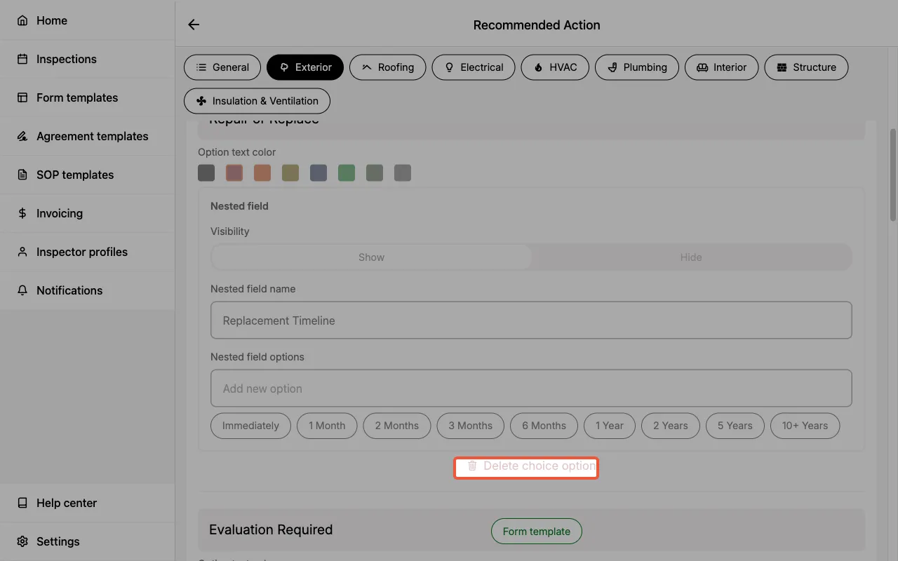
- Enter the component where you would like to delete choice options.
- Select the edit icon next to the field which contains the choice options that should be deleted.
- Locate the choice option you would like to delete.
- Select
Delete choice optionbelow the choice option that should be deleted.
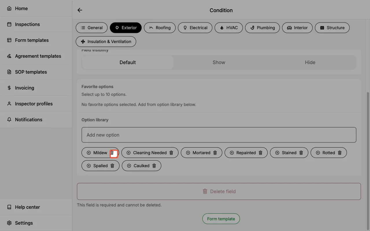
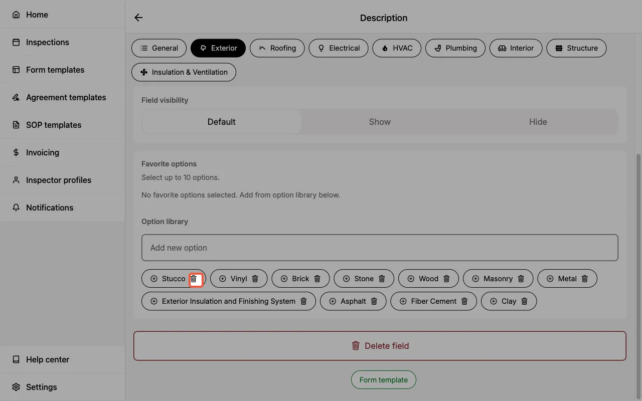
- Enter the component where you would like to delete field options.
- Select the edit icon next to the field which contains the field options that should be deleted.
- Locate the option library.
- Select the trash icon next to the option that should be deleted.
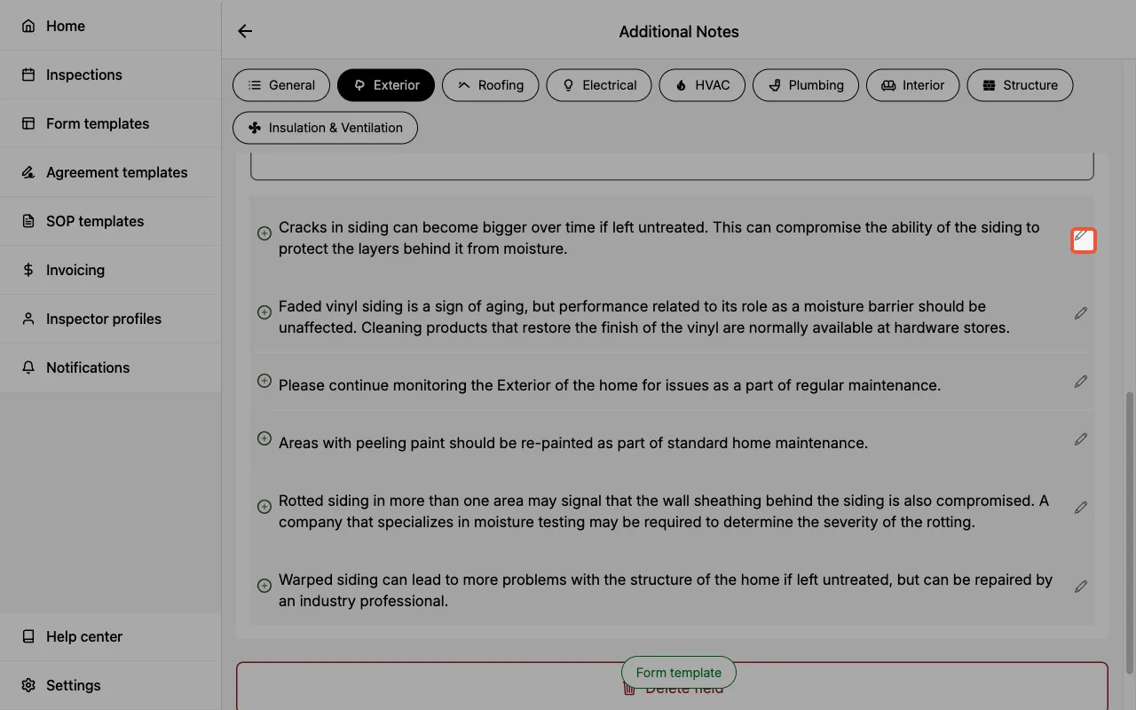
- Enter the component where you would like to delete field options.
- Select the edit icon next to the field which contains the field options that should be deleted.
- Locate the option library.
- Select the edit icon next to the field option that should be deleted.
- Select
Delete option.
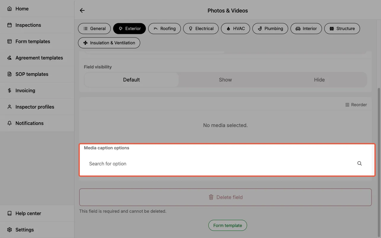
- Enter the component where you would like to delete saved captions.
- Select the edit icon next to the media field which contains the captions that should be deleted.
- Locate the Media caption options section.
- Select the caption that should be deleted and remove it.
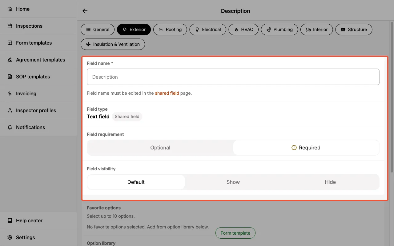
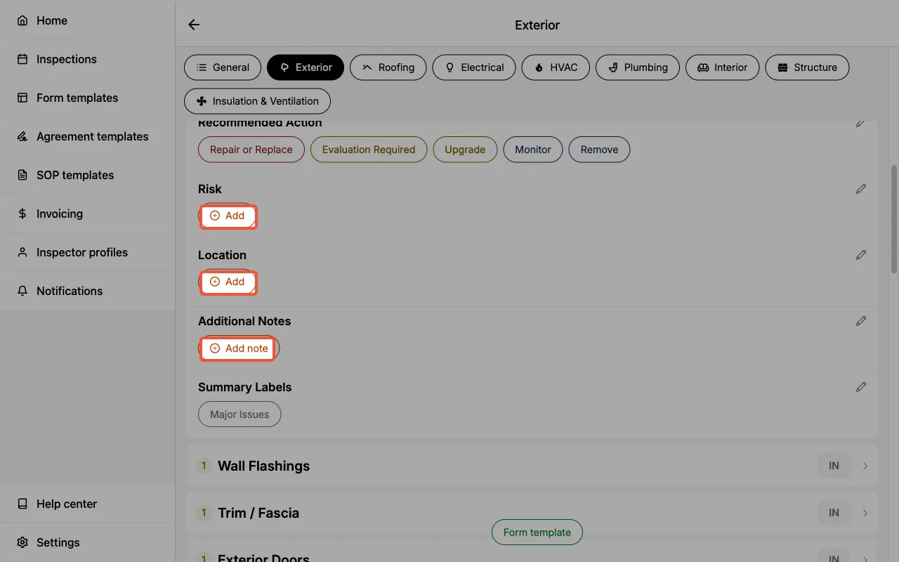
Additional field settings
In addition to the field name and field type there are a number of settings to help you customize your Form Template.
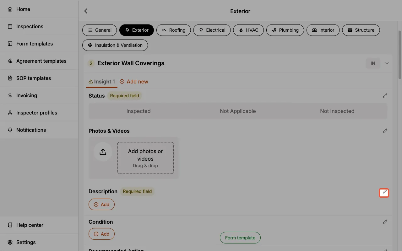
Field requirement
A field can be toggled as required or optional.
- Required — When selected, the component list page will provide a visual indicator. This helps you quickly assess whether any component inspection was missed.
- When all required fields within a component are completed, the visual indicator will automatically update to a green checkmark.
- Optional — When selected, the field is optional in your inspection.
- By default, all fields are set as optional.
The field requirement toggle helps ensure required components and their fields are completed in a consistent manner. This is used to track your overall completion of the inspection in the Progress checklist.
In templates created by Eneris, the fields that are required are based on the relevant association's Standards of Practice.
Field visibility
A field's visibility controls whether it appears inside the inspection form, on the final report, or both. There are up to four settings depending on whether you're editing a field at the shared field level or inside a specific component:
- Show — The field appears in the inspection form and in the final report.
- By default, all fields are set to Show.
- Hide — The field still appears inside the inspection form, but is excluded from the final report. Entries remain visible to you and your team within the Inspection.
- Useful for internal notes, personal reminders, or photo proof that you don't want to share with clients.
- e.g., Your Form Template includes two hidden fields in the Garage Doors component: a checklist to confirm the garage door is closed after inspection, and a media field for photo proof. Both are captured during inspection but never appear in the client report.
- Disabled — The field is hidden in both the inspection form and the final report.
- Use this to turn a field off entirely without deleting it. This is the only way to remove the five fields that cannot be deleted (
Status,Photos & Videos,Condition,Recommended Action,Summary Label) from your workflow. - e.g., You don't use the
Recommended Actionfield in your process. Setting it to Disabled at the template level removes it from every component in the form and from the report.
- Use this to turn a field off entirely without deleting it. This is the only way to remove the five fields that cannot be deleted (
- Default — Only available when editing a shared field from inside a specific component. The field uses the visibility setting defined in the shared field.
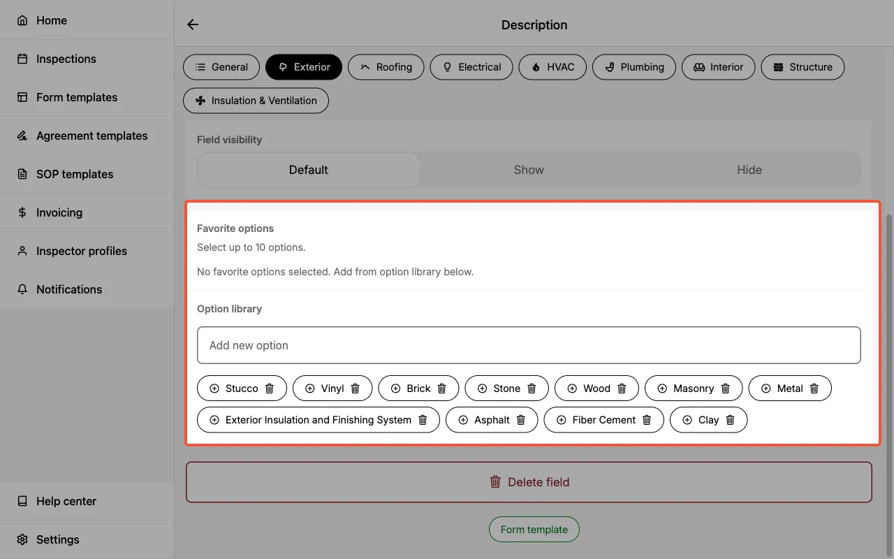
Favorite options
Both text and multi-line text field types allow you to select up to 10 favorite field options from the option library.
- Text fields — When a field option is selected as a favorite, it will appear next to the
Add Newbutton for easy selection when inspecting the component.- Add favorites by selecting the
+icon next to the field option in the option library.
- Add favorites by selecting the
- Multi-line text fields — When a field option is selected as a favorite, it will appear below the text box when you select
Add new textin the field entry.- Add favorites by selecting the
+ Addicon next to the field option in the option library.
- Add favorites by selecting the
Option library
A list of all saved responses for the field.
Category limitations
In addition to general limitations, you may also add category limitations.
- After entering a category, the top menu bar will have an option for
Limitations. Enter any category-specific inspection limitations here.- e.g., If you are inspecting a roof and part of it is covered in solar panels you may wish to enter that limitation here.
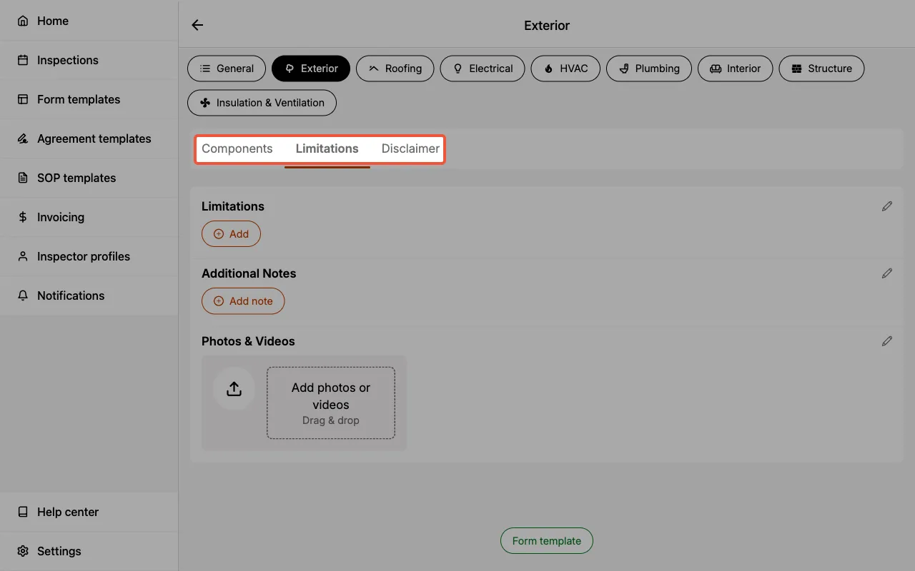
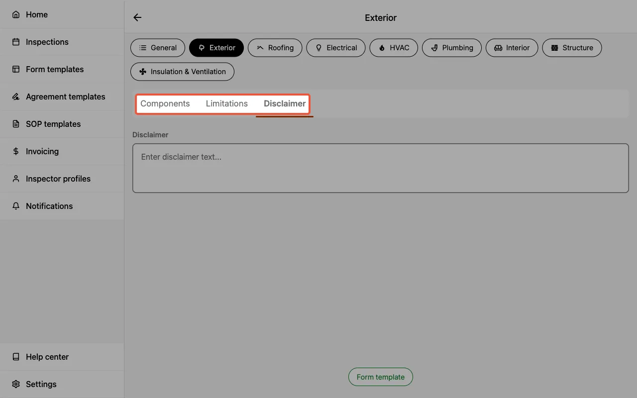
Category disclaimer
Inform your client(s) about category-specific disclaimers from your inspection.
- After entering a category, the top menu bar will have an option for
Disclaimer. Enter any category-specific inspection disclaimer here.- e.g., The Standards of Practice you created, or follow, may have specific disclaimers you should provide to your client(s).