Inspection Forms
An Inspection Form is where the bulk of your inspection data is entered and organized. It contains all the categories, components, fields, and field options used to document your entries during an inspection.
Each form acts as a structured workspace, allowing you to:
- Record detailed entries (e.g. roof is in good condition, mold on interior wall, water heater needs replacement, etc.)
- Attach media (photos, videos)
- Select field options or enter free-form notes
- Add general limitations to your inspection
- Customize what's shown in the final report
Whether you're performing a home inspection, mold inspection, asbestos inspection — or any other type of inspection — Inspection Forms keep your data organized, clear, and report-ready.
How Form Templates and Inspection Forms are related
Form Templates allow for the customization of inspection lists, and the pre-filling of report fields. Once saved, they are available for selection when creating a new Inspection,
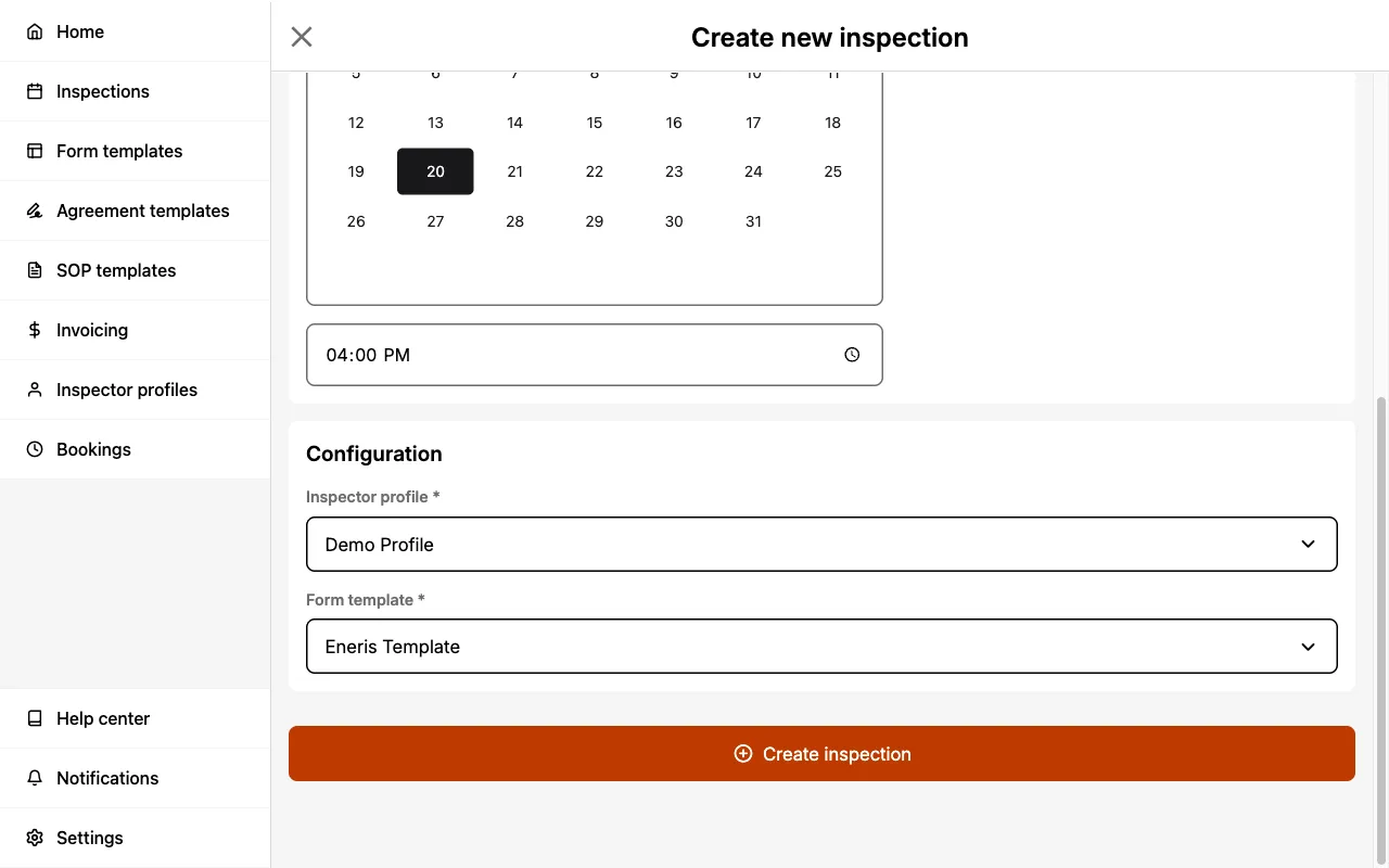
and when adding a new Inspection Form to an existing Inspection.
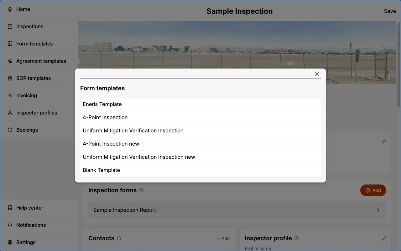
If we were to put it into simpler terms:
- Think of a Form Template as a physical document you could bring with you to any inspection.
- If you decide to bring a copy of one of those documents with you to an inspection it is now an Inspection Form for that particular job.
Many Inspection Forms to one Inspection
Each Inspection can have one or more Inspection Forms associated with it. Inspection Forms allow you to associate different types of inspections with a single inspection site visit.
-
e.g., If you are certified to perform multiple types of inspections (e.g. home inspection, asbestos inspection, radon inspection, etc.) on a property then you can pre-setup various Form Templates and load them into the same Inspection.
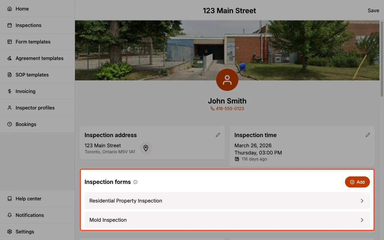
Each Inspection Form allows you to generate a distinct PDF report pertaining specifically to the inspection performed.
Inspection Form framework
This is the data structure of your Inspection Form:
- Category — A high-level system (e.g. Interior, Roofing)
- Component — A specific element within a system (e.g. Flooring, Gutters)
- Entry — A specific observation (e.g. Water damage)
- Each entry is a separate item in the report, so you can record multiple entries for the same component.
- e.g., During your inspection you may be inspecting multiple exterior doors. If both the front door and the back door are damaged in different ways you could create separate entries for the exterior door component.
- Each entry is a separate item in the report, so you can record multiple entries for the same component.
- Field — A specific input area (e.g. Description, Condition, Risk, Location, Recommended Action)
- Field Option — Predefined choices within a field (e.g. “Minor”, “Major”, “Not Present”)
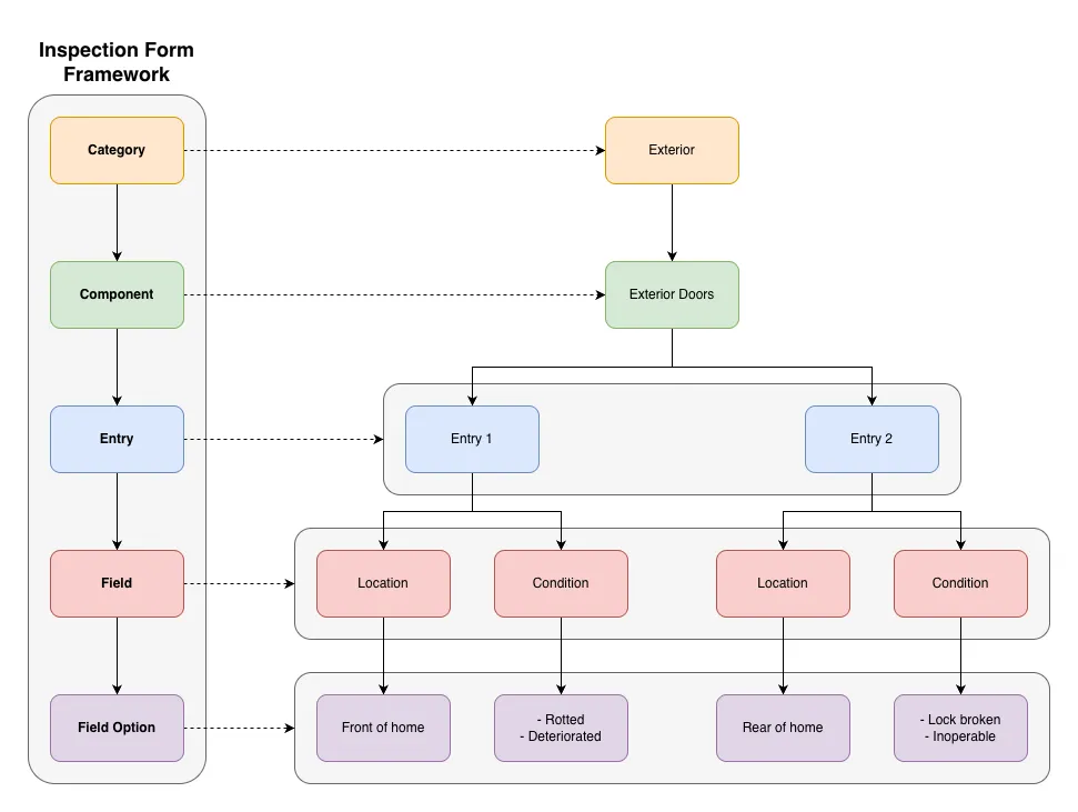
This structure helps keep your reports organized and easy to navigate.
Every part of the framework is customizable. Here are some example use cases:
- If a category is unavailable by default, you can create it.
- If you're a roofing contractor and never inspect HVAC systems, you can delete the HVAC category.
- If the component you are inspecting has different areas (living room flooring vs. kitchen flooring) in different conditions then you can create multiple entries.
- If you're an Eneris admin at your company and need to edit the field options to use company approved terminology, you can do so quickly and without needing to interact with the Eneris team (but we're always happy to help).
Inspection Form Sections
Report title
Set the title that appears on the report's cover page

and in the Inspection Forms section.
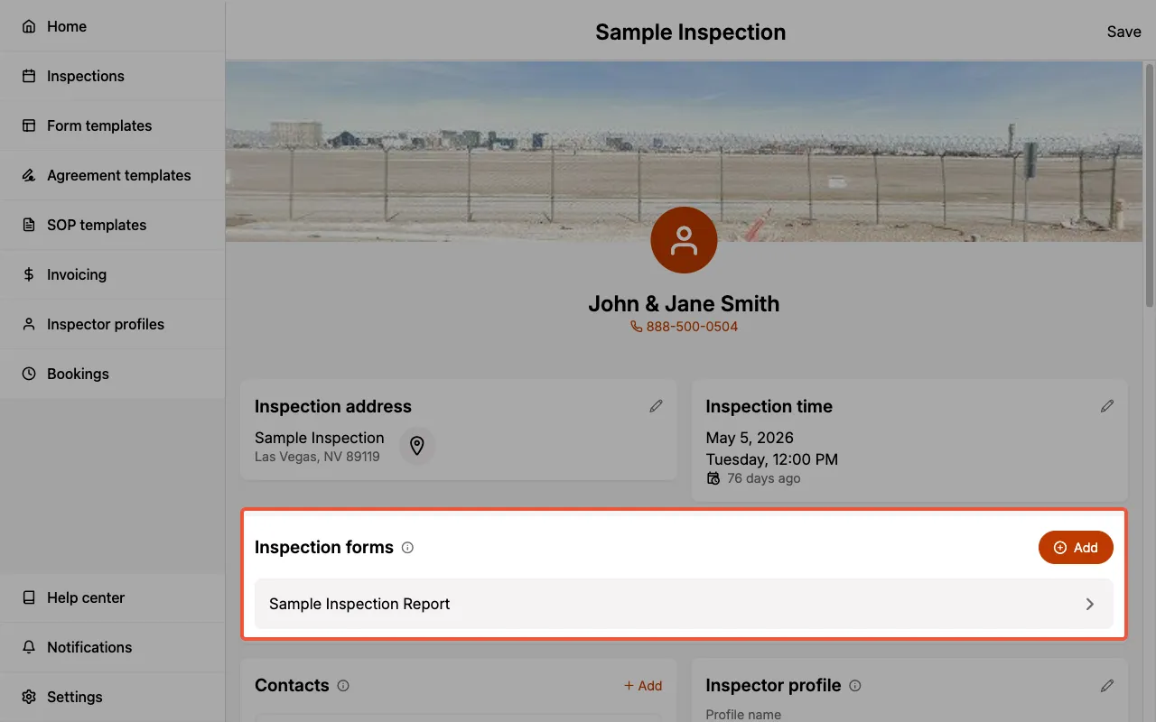
You must Sync the Inspection Form in order for the Report Title to update at both locations.
Inspection Categories
The categories of inspection items.
Editing Inspection Categories
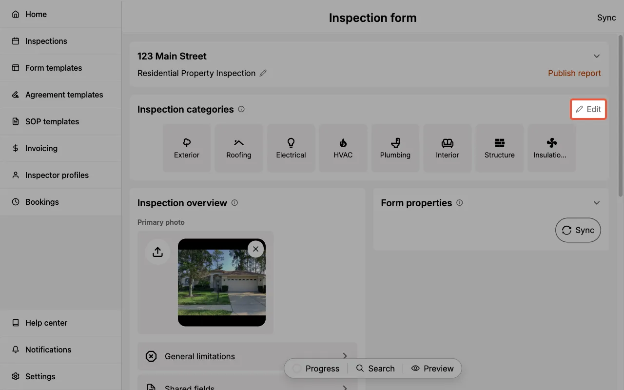
Edit Inspection Categories by selecting Edit next to the Inspection categories heading.
Select Reorder, drag and drop categories to rearrange them, then select Done.
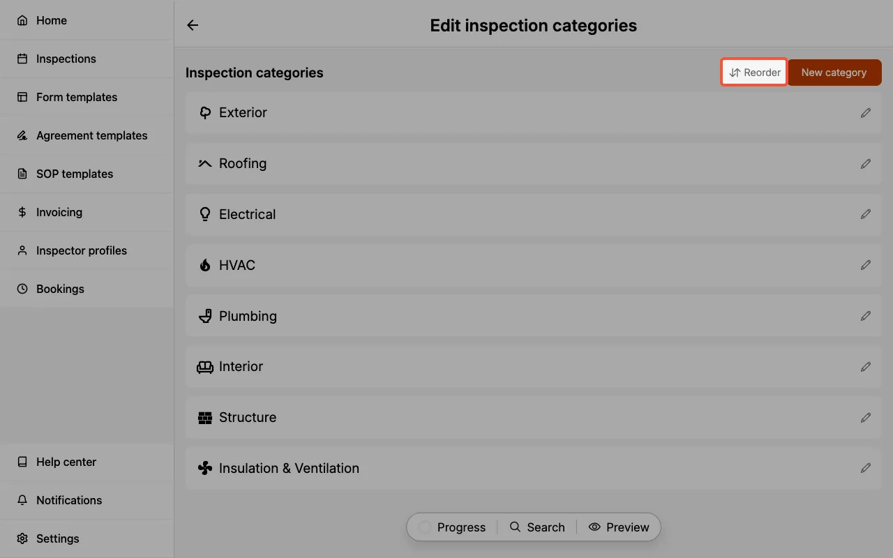
Select the pencil icon next to a category to:
- Edit the category name
- Update the category icon
- Delete the category
Add new Inspection Categories
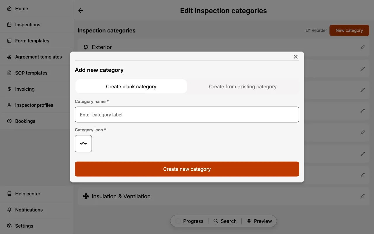
- Select
Editnext to the Inspection Categories heading. - Select
New categoryto open the Add new category sheet. - Choose
Create blank categoryorCreate from existing category. - Enter a category name and select an icon.
- Select
Create new category.
Form Tab Bar
The Form Tab Bar is a floating pill that provides quick access to four tools:
- Progress: Opens the Progress Checklist
- Search: Opens the Search Tool
- Media: Opens the Media folder panel (desktop web only)
- Preview: Opens a preview of your report
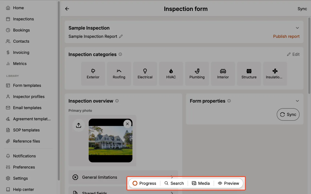
On mobile, the tab bar appears as a bottom navigation bar with Progress, Search, and Preview. The Media tool is only available on desktop web.
Progress Checklist
The Progress Checklist shows the overall completion percentage and count for your Inspection Form.
- Each category is listed with its completion count (e.g. 23/23).
- Expand a category to see the status of individual components (Required, Empty, or Complete).
- Use the Expand all / Collapse all toggle to quickly review all categories.
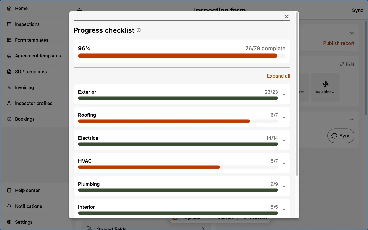
Use the Progress Checklist before publishing to ensure all required components are complete.
Search Tool
The Search Tool lets you find components and fields across the entire Inspection Form.
- Type at least 2 characters to begin searching.
- Results are grouped by category with highlighted matches.
- Select a result to navigate directly to that component.
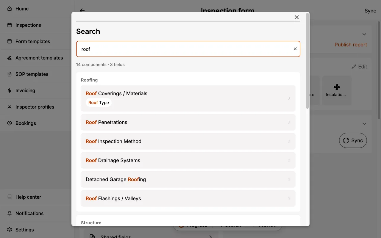
The search uses fuzzy matching — you don't need an exact match to find what you're looking for.
Media folder panel
The Media folder panel lets you browse a folder on your computer from inside the Inspection Form and drag its photos, videos, and PDFs straight into the report. If you shoot on a camera or phone and offload everything to a folder afterwards, this is the fastest way to get those files into the right place.
The panel is read-only. Eneris never changes, moves, or deletes anything in your folder.
The Media folder panel is available on desktop web only, when the browser window is wide enough to show the form and the panel side by side. It is not shown on mobile web, iOS, or Android.
Opening the panel
Select Media in the Form Tab Bar. The panel docks to the right of the form and the form narrows to make room. The Media icon and label turn orange while the panel is open.
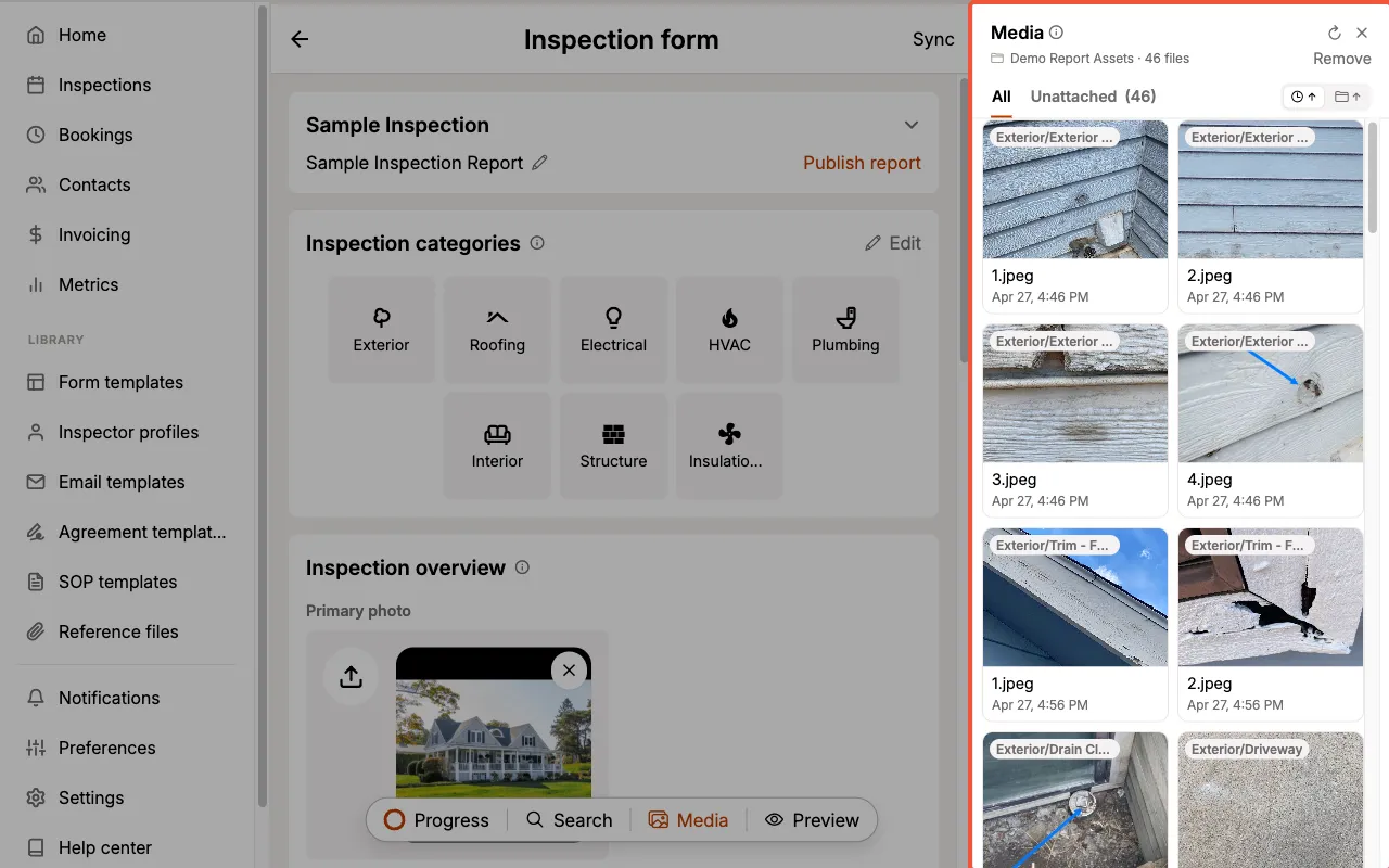
- Select Media again, or the X in the panel header, to close it.
- The panel remembers the folder you chose for the rest of your session, even if you close and reopen it.
- Nothing is saved between sessions. The next time you open the form, choose the folder again.
Choosing a folder
- Select
Choose folderand pick the folder in your browser's folder picker. You can also drop a folder from your desktop anywhere on the panel. - The panel reads the folder, then shows its name and the number of usable files at the top.
- Subfolders are included, so you can point the panel at a whole inspection's worth of photos at once.
- The panel lists the same photo and video formats as media fields, plus PDFs. Hidden files and any other file types are skipped.
- If the folder has nothing the report can use, the panel shows No photos found with a
Choose another folderbutton.
HEIC photos show a file-type placeholder instead of a thumbnail, because browsers can't display them. They drag into the report like any other photo and are converted as they are added.
Browsing the listing
- All shows every file in the folder. Unattached shows only the files that haven't been placed in this report yet, with a live count.
- The Time view (the default) lists files in the order you shot them, with a chip on each tile showing which subfolder it came from. Select Time again to flip between oldest first and newest first. Dates appear on tiles when the folder spans more than one day.
- The Folders view groups files under their subfolder, with a count on each group. Files at the top level of the folder are grouped last under Top level. Select Folders again to flip between A-Z and Z-A.
- Videos show a play icon and PDFs show a document icon with an Appendices only chip.
- Hover over a tile to reveal the magnifier, then select it to open a full-size preview. Use the arrow keys to step through the listing in the order it appears on screen.
Dragging files into the report
Press and hold a tile, then drag it into the form. Every place that can take the file is outlined as soon as the drag starts, and the one under your pointer fills in. Release to add the file.
Where each type of file can go:
- Photos: Component Photos & videos fields, Reference images fields, the Primary photo, and Appendices.
- Videos: Component Photos & videos fields only.
- PDFs: Appendices only.
Dropped files go through the same upload path as any other media, including compression, HEIC conversion, and the 5-minute video limit.
A file dropped somewhere it can't go is refused with a message, such as PDFs can only be added to Appendices. or Videos can't be added here. Other files in the same drop are still added.
If a file was moved or deleted after you chose the folder, the drop shows File unavailable and the tile is marked No longer available. Refresh to update. Select Refresh to pick the folder again.
Tracking what's been used
- Once a file has been placed in the report, its tile dims and shows a green check, and it disappears from the Unattached tab.
- Used tiles can still be dragged, so the same photo can appear in more than one place.
- If you remove the media from the form, the tile returns to Unattached.
- When every file has been placed, the Unattached tab shows Every photo is in the report.
- Used status is stored with the uploaded media, so it comes back after a reload, or in a later session, when you choose the same folder again.
Photos attached before the Media folder panel existed can't be matched to files in your folder. They stay listed as unattached even if they are already in the report.
Refreshing, removing, and resizing
- Refresh opens the folder picker again. Choose the same folder to pick up files added since you last read it.
- Dropping a different folder onto the panel replaces the current listing.
- Remove clears the listing and returns the panel to its starting state. Media already placed in the report stays where it is.
- Drag the panel's left edge to resize it. The width is remembered on this device.
Inspection overview
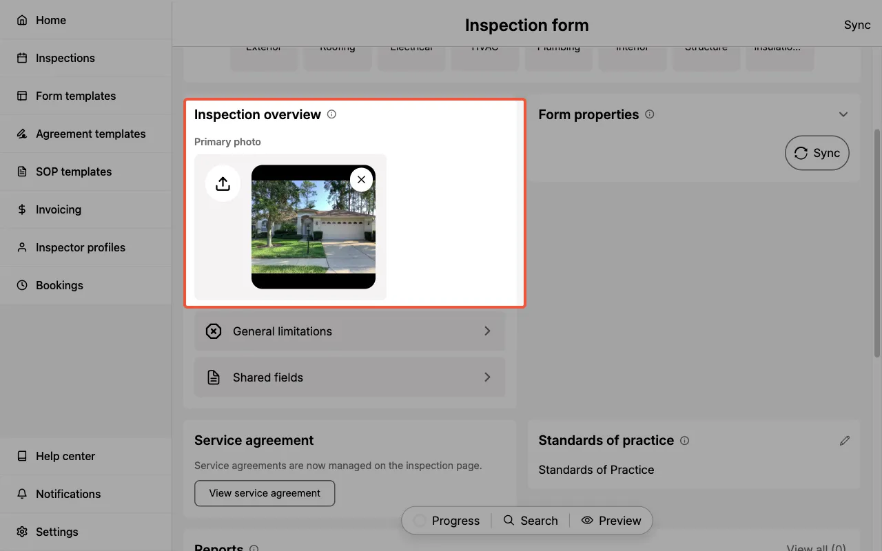
This section enables you to set the Primary photo, add General limitations, and manage Shared Fields.
Primary photo
This is the main image shown on the report's cover page.
- A wide exterior photo of the property is commonly used.
- On desktop web, you can also drag a photo in from the Media folder panel.
General limitations
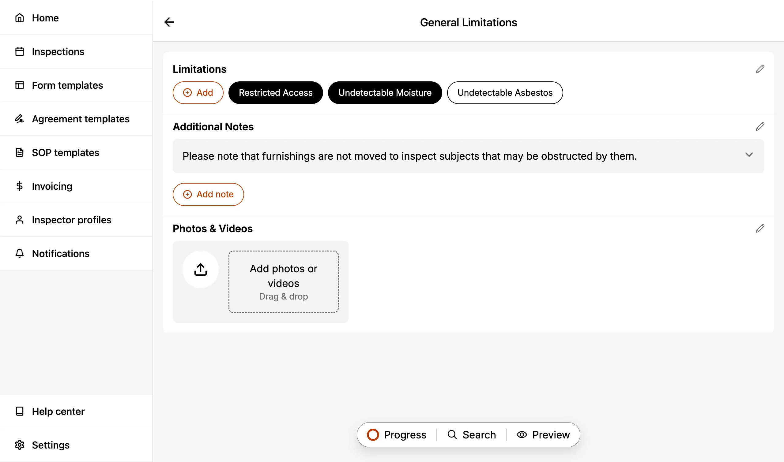
Allows you to note any non-category specific limitation associated with your Inspection.
- Limitation: Shorter length comments (50 characters max)
- Additional notes: Longer length comments (1,000 characters max)
- Photos & videos: Attach supporting photos and videos regarding limitations.
Here's what the General limitations page looks like when it is filled out:
Keep in mind that this is for general limitations.
You may also enter category-specific limitations.
Shared Fields
Shared Fields automatically appear in every component of your Form Template. Use them for any common inputs in your inspection workflow.
- e.g. You may want a
RiskorLocationfield available in every component. Creating it as a Shared Field means you only need to create them once and they will be available in every component.
This helps you save time and keeps your workflow and data entry consistent.
You can delete a Shared Field from a component if it's not required. However, note that you will not be able to re-add it at this time.
The Status, Photos & Videos, Condition, Recommended Action, and Summary Label fields cannot be deleted. They can only be hidden.
Photos and videos
Attach visual documentation to your Inspection Forms using media fields. Photos and videos help illustrate your findings and provide clear evidence for your clients.
You can add them from your media library or capture new ones directly in the Eneris app. On desktop web, you can also drag them in from a folder on your computer using the Media folder panel.
Supported file types
The media field supports the following file formats:
- Images – JPEG (.jpeg, .jpg), PNG (.png), HEIC (.heic), HEIF (.heif)
- Videos – MP4 (.mp4), MOV (.mov)
These formats ensure your media displays correctly in the final report.
Camera controls
The in-app camera includes familiar controls to help you capture clear, well-framed media:
- Photo and video modes: Switch between photo and video capture using the mode button next to the shutter. In video mode, tap the shutter to start recording and tap the stop button to finish the clip.
- Zoom: Pinch to zoom, or tap the zoom presets (e.g. 0.5x, 1x) to switch lenses instantly. Available presets depend on your device's cameras.
- Aspect ratio: Cycle between 4:3, 1:1, and 16:9 framing. Your selection is remembered for future captures. (1:1 is available for photos only.)
- Flash: Tap the bolt to cycle the capture flash through auto, off, and on. Auto is the default and fires only when the scene is dim, which keeps photos sharp in poorly lit spaces without you having to think about it. Your choice is remembered for future captures. The button is hidden on devices with no flash.
- Torch: Toggle a continuous light for dark spaces like attics and crawl spaces. While the torch is lit, the flash is held off, since firing it would briefly cut the torch light you turned on.
- Focus: Tap anywhere on the preview to focus on that spot.
- Exposure: After tapping to focus, drag the brightness slider to lighten or darken the shot. Available on supported devices.
- Volume button capture: Press either hardware volume button to take a photo, or to start and stop recording in video mode, just like your device's native camera.
- Swipe to close: Drag the camera preview downward to dismiss the camera. To avoid losing footage, swiping is disabled while a video is recording.
Videos are limited to 5 minutes each. This applies to both videos recorded in the app and videos uploaded from your media library. While recording, a timer above the shutter shows your elapsed time against the limit, and recording stops automatically when you reach it. A longer video selected from your library is rejected with a File rejected message, so trim it or split it into multiple clips first.
Camera permissions
The camera requires access to your device's Camera, Microphone, and Media library. If any of these permissions are missing, a Permissions required screen appears listing what still needs to be allowed. Select Grant Permissions to open your device settings, or Return to go back.
If your device has no available camera (or another app is using it), a Camera unavailable screen is shown instead.
Photo markup
Add visual annotations directly to your inspection photos to highlight specific areas of concern or provide additional context for your clients.
The photo markup feature helps you:
- Draw attention to defects – Circle cracks, highlight water damage, or point out specific issues.
- Add clarity – Use arrows, shapes, and drawing to make your findings unmistakable.
- Professional presentation – Marked-up photos appear in your final PDF report with annotations intact.
Photo markup helps your clients quickly understand exactly what you're pointing out in each photo — reducing confusion and follow-up questions.
Accessing photo markup
To add annotations to a photo:
- Navigate to the component where you want to add an annotated photo.
- Locate the media field.
- Take a new photo or select an existing photo from your device.
- Once the photo appears, select it to open the photo markup interface.
- Use the annotation tools to mark up the photo.
- Select
Saveto apply your annotations.
Photo markup replaces the original photo with the annotated version. Make sure your annotations are accurate before saving, as the original unmarked photo will not be preserved.
Available annotation tools
The photo markup interface provides several tools to help you annotate photos effectively:
- Pen tool – Draw freehand lines to circle areas, underline text, or sketch annotations.
- Shapes – Add pre-defined shapes to highlight specific areas:
- Arrow – Point to specific defects or areas of concern.
- Circle – Highlight round areas or encircle multiple items.
- Rectangle – Box in rectangular areas or sections.
- Oval – Highlight oval-shaped areas.
- Star – Mark priority items or call attention to critical findings.
- Color picker – Choose from multiple colors to differentiate between different types of issues or to ensure annotations are visible against the photo background.
- Line width – Adjust the thickness of your pen strokes and shape outlines for better visibility.
- Photo rotation – Rotate photos to correct their orientation, ensuring images appear upright and properly aligned in your final report.
- Undo – Revert your last annotation action, allowing you to correct mistakes one step at a time.
- Clear – Remove all annotations from the photo at once, letting you start fresh if needed.
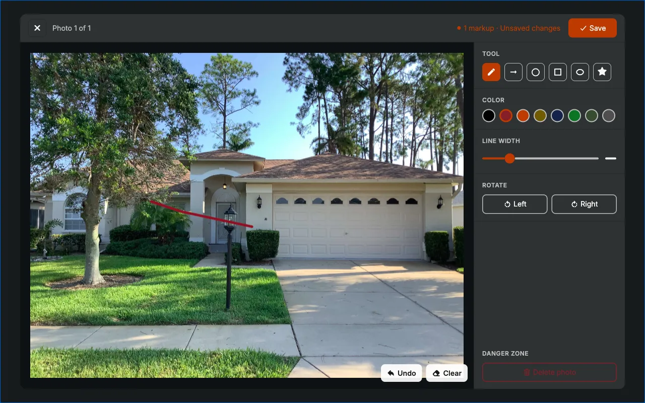
Use contrasting colors for your annotations to ensure they stand out clearly against the photo background.
Form properties
This section contains important information about your Inspection Form.
Form ID
The unique identifier of the particular Inspection Form you are currently reviewing.
Status
Status is comprised of three timestamps which detail when the Inspection Form was:
- Most recently synced.
- Most recently saved.
- Created.
For more information on Syncing click here. For more information on Saving click here.
Sync
There's also a Sync button on the right side.
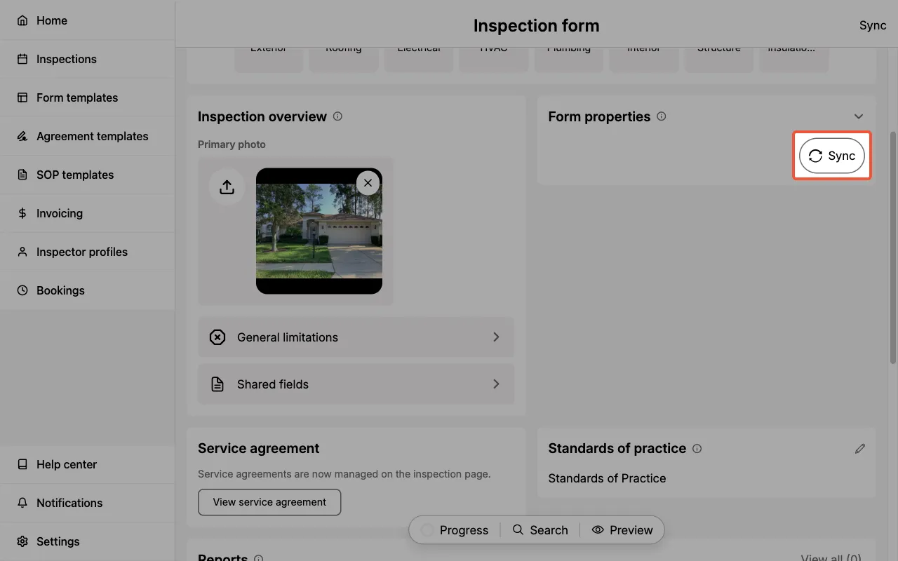
For more information on Syncing click here. For more information on Saving click here.
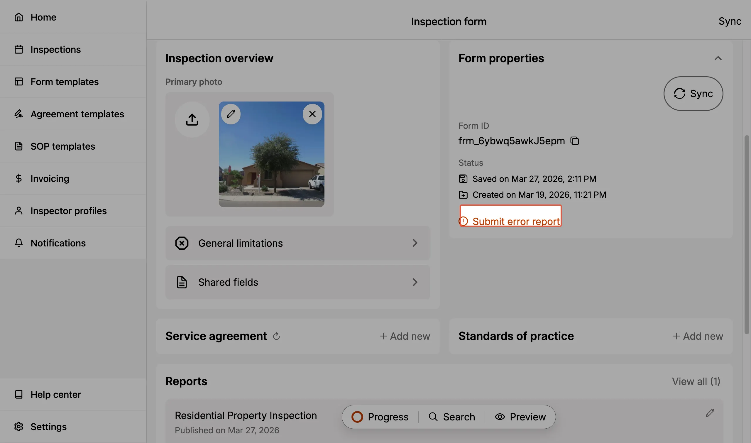
Submit error report
If you run into an error for a particular Inspection Form our support team may request that you submit an error report. The error report allows our support team to further investigate and assist you.
- The error report can be submitted quickly and only requires a press of a button (plus any additional information you would like to provide).
Appendices
Appendices are supporting documents attached to an Inspection Form. Each one becomes a lettered appendix (A, B, C, and so on) at the end of the published report.
Use them for the evidence that belongs with a report but doesn't fit inside a category: an equipment certificate, a code excerpt backing up a deficiency, or a lab result for the property.
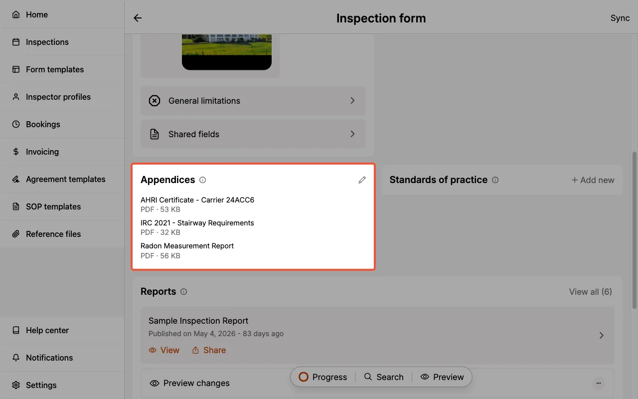
A form can hold up to 5 appendices.
Two ways to attach a file
Select Add new (or the pencil icon if files are already attached) to open the Appendices panel. From there you have two options.
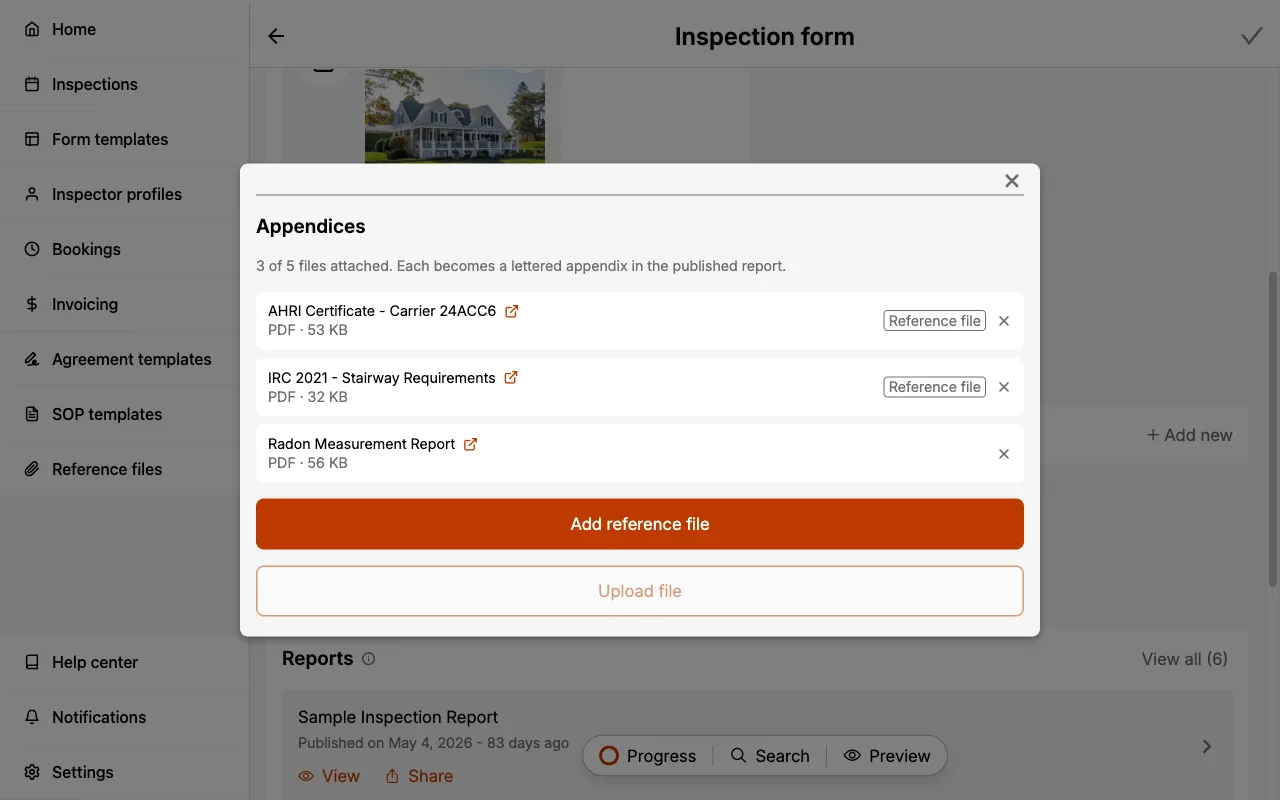
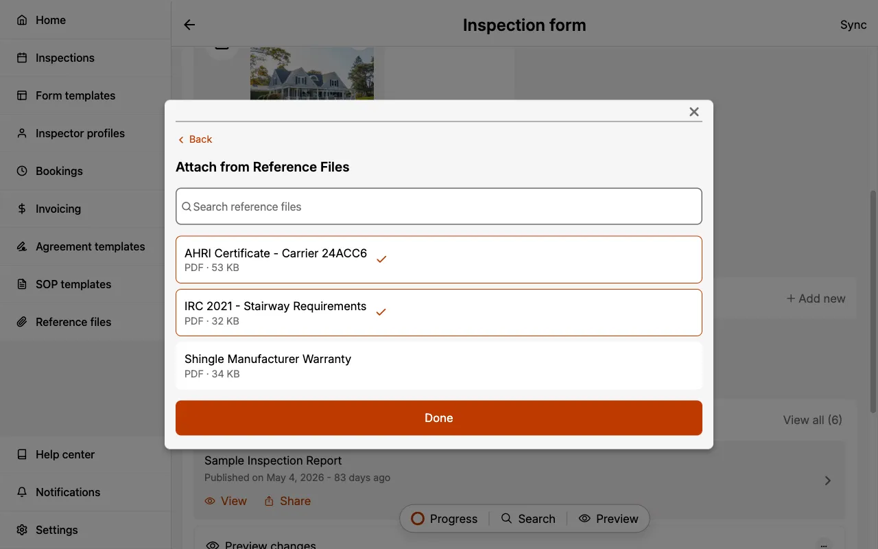
Add reference file attaches a document from your team's Reference Files library. Search for the file, select it, and select Done. You can select several at once.
Upload file attaches a document to this form only. It is not added to the team library, which makes it the right choice for anything specific to a single property.
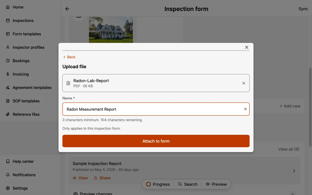
Files attached from the library are marked with a Reference file tag so you can tell the two apart at a glance. Select the ✕ next to any file to remove it from the form.
On desktop web, you can also drag a PDF or image from the Media folder panel onto the Appendices section.
Removing an appendix from a form never deletes the underlying document from your Reference Files library.
Appendices in the report
Appendices appear at the very end of the report, after every inspection category, in the order they are listed on the form.
In the PDF report, a final Appendices page lists each document as Appendix A - <name>, and the documents themselves follow as full pages.
In the web report, appendices get their own section and navigation tab, with each document lettered and linked.
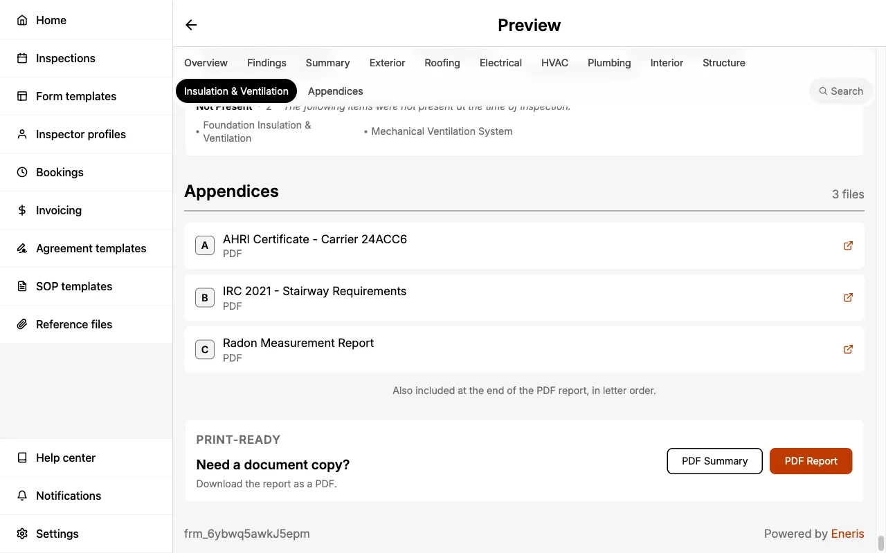
Appendices are included in the main PDF report only. Supplementary forms such as 4-Point and Wind Mitigation are published as their own documents and do not carry appendices.
Reports
This section allows you to preview PDF changes, manage published reports, and share the final PDF report with your client(s).
Preview changes
Allows you to quickly check how your report looks before publishing.
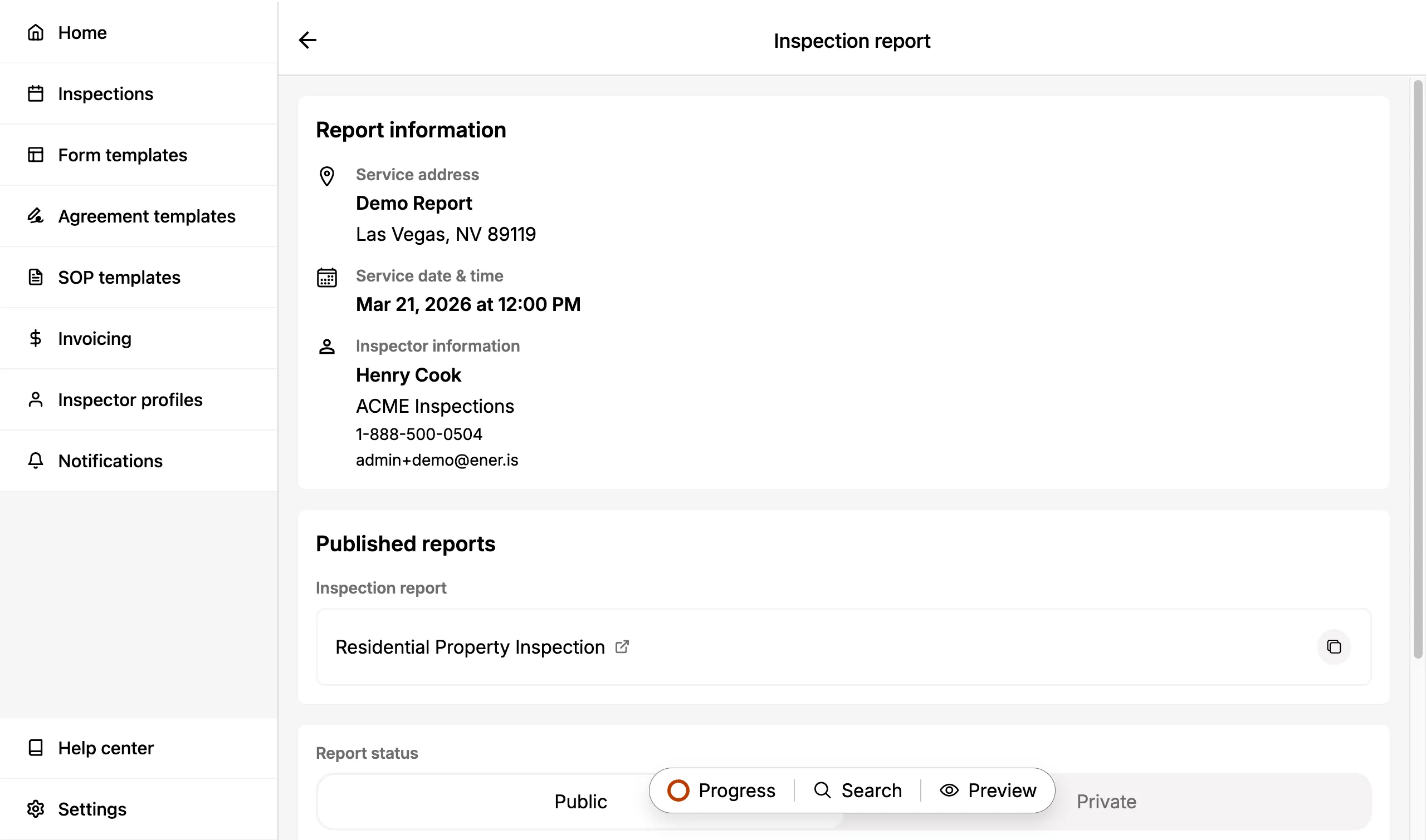
Open latest published PDF report
Opens a menu for the most recently synced PDF report.
Inside, you will see options to:
- Open the finalized PDF report your client(s) would receive.
- Toggle the report to public or private.
Sharethe report.- Copy the report URL.
Delete report, which deletes the specific published report you are currently reviewing.
Share
Allows you to email the completed PDF report.
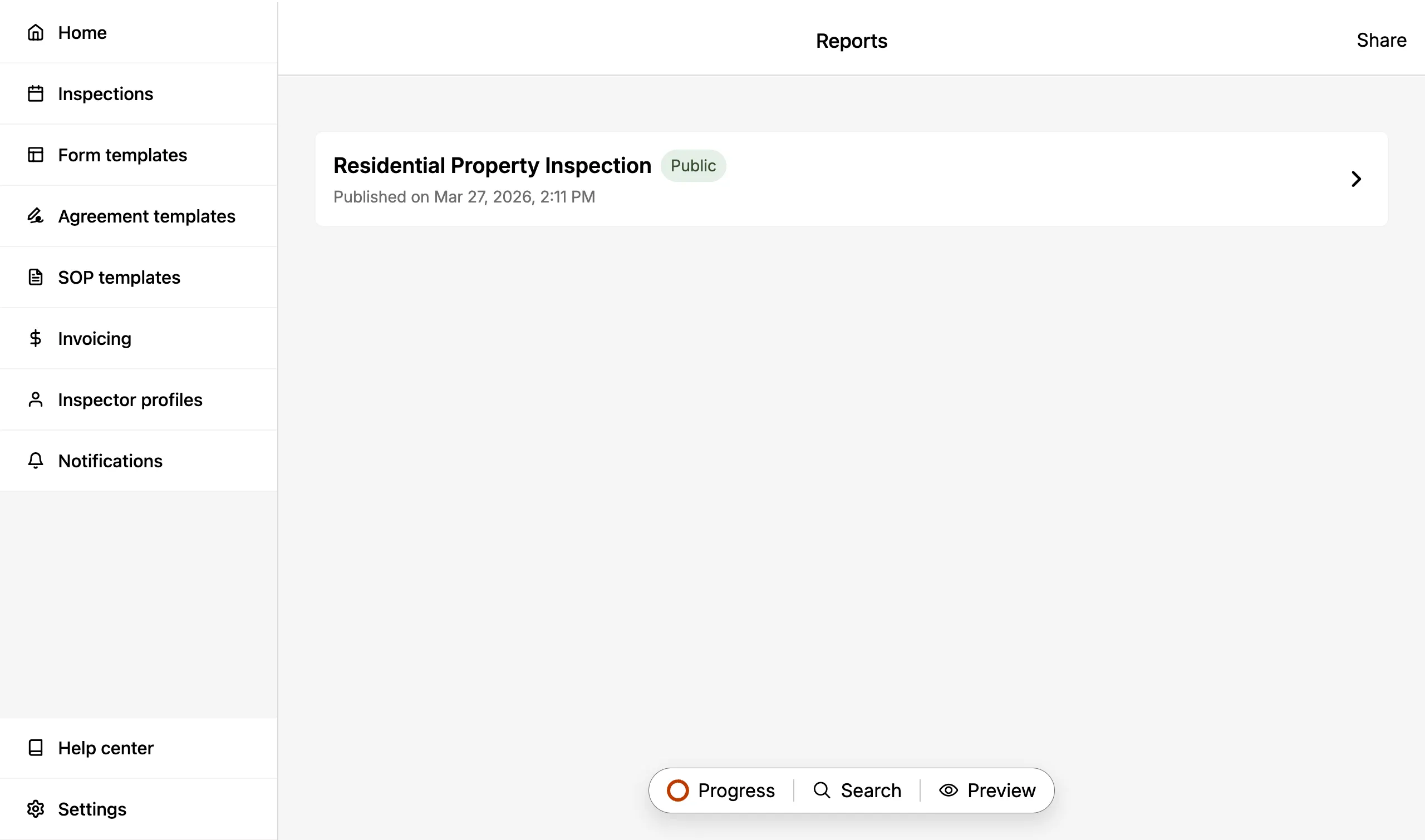
View all published reports
Shows the history of published reports.
Publish
The Publish button publishes your report.
Return to inspection
Navigates you back to the main Inspection page.
Delete form
Deletes the Inspection Form you are currently in.
- You can always add new Inspection Forms in the Inspection page.
Deleting an Inspection Form also deletes its associated Service Agreement, including any collected signatures, as well as any published reports for that form. This action cannot be undone.