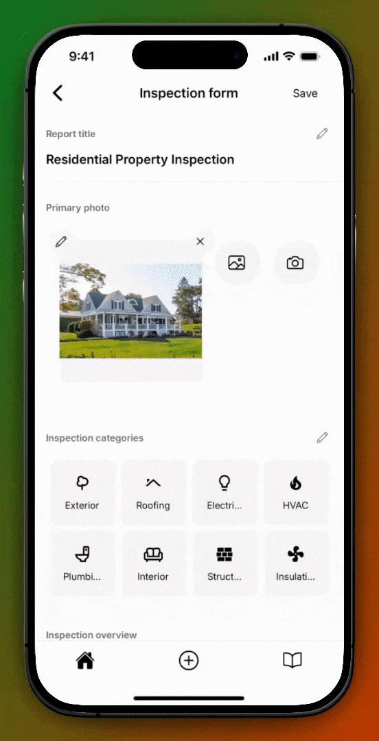
Customizing Inspection Forms
You can customize Inspection Forms in two ways:
- Through Form Templates
- Ad-hoc per Inspection Form
Customize Through Form Templates
Set up reusable Form Templates that include the exact customizations you need for any type of inspection.
- Pre-selected entries – Select disclaimers, limitations, and any other field option that should be automatically applied every time you use a particular Form Template.
Once created, Form Templates can be reused across multiple inspections, saving time and improving report consistency.
Ad-Hoc Customizations Per Inspection Form
Make one-off changes directly in an individual Inspection Form.
- e.g., The property you are inspecting has an outdoor swimming pool. Even though a swimming pool is not part of your Form Template, you can easily add an
Outdoor Swimming Poolcomponent to yourExteriorcategory if you need to inspect it.
Types of customizations
Customizations include:
- Custom categories – Group components however you want.
- Custom components – Add new inspection items or rename existing ones.
- Custom fields – Create new fields
- Custom field options – Add or edit the field options.
- Required/Optional fields – Choose which fields must be filled out
- Visibility – Hide fields from the final report
- Edit field names – Rename fields to suit your wording
- Edit field options – Change placeholder or default text for clarity
- Edit disclaimers and limitations – Change placeholder or default text for clarity
You have full control over how your Inspection Forms look and behave — without needing to code.
See the Inspection Form framework documentation for a detailed explanation on categories, components, fields, and field options.
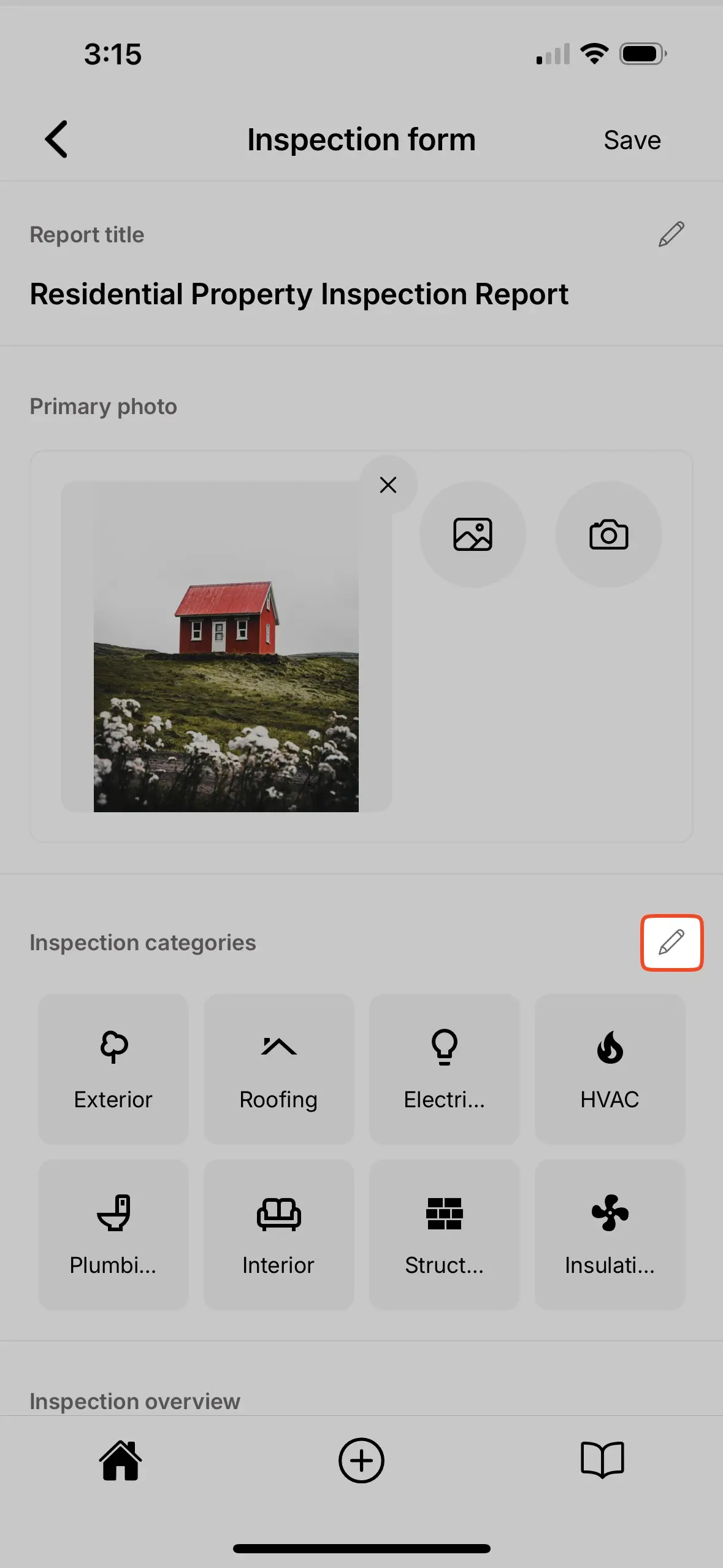
Creating, editing, and deleting categories
The sections below cover creating, editing, and deleting categories.
Creating categories
To create new categories:
- Select the edit icon in the
Inspection categoriessection. - Scroll to the bottom of the page.
- Enter a
category name. - Select a
category icon. - Select
create new category.

When creating a new category you have the option to Create blank category or Create from existing category.
Create blank categorymeans there are no components within the new category.Create from existing categorymeans you can select an existing category and duplicate all of the components, fields, and field options within as a starting point. You can then further customize this duplicated category to suit your needs.
Editing categories
To edit existing categories:
- Select the edit icon in the
Inspection categoriessection. - Select the edit icon next to the category you would like to edit.
- Edit the
category nameandcategory iconas desired. - Select
Save.
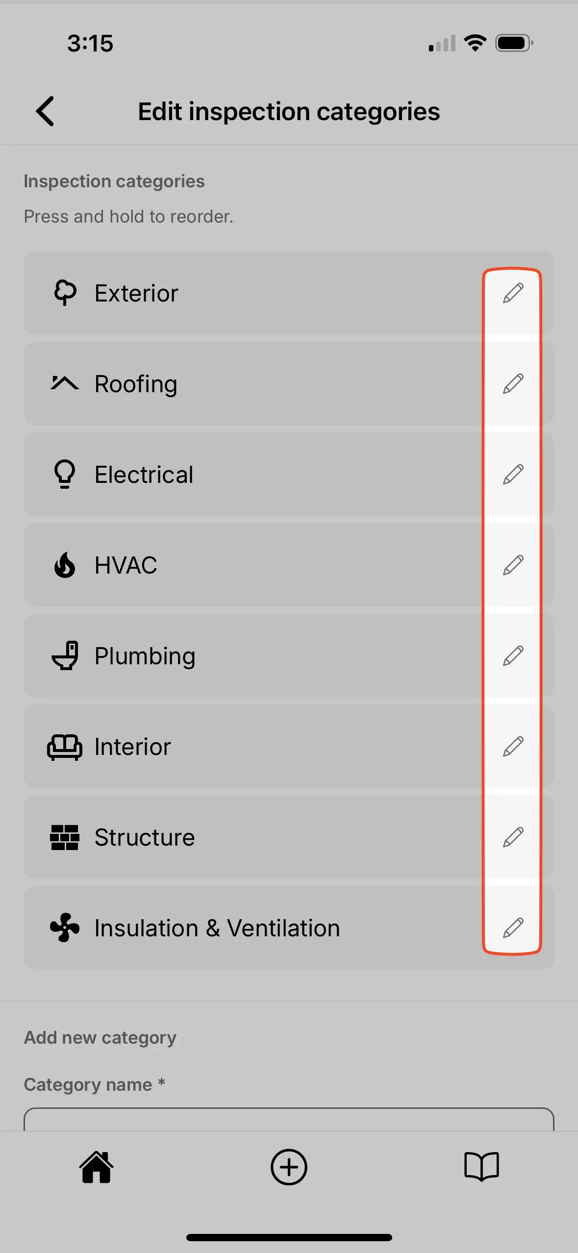
Deleting categories
To delete existing categories:
- Select the edit icon in the
Inspection categoriessection. - Select the edit icon next to the category you would like to delete.
- Select the
Deletebutton.
Creating, editing, and deleting components
The sections below cover creating, editing, and deleting components.
Creating components
To create new components:
- Enter the category in which the new component should be created.
- Select the edit icon near the top of the component list.
- Enter the new component name.
- Select
Create. - The new component has been successfully created and can be located at the bottom of the component list.
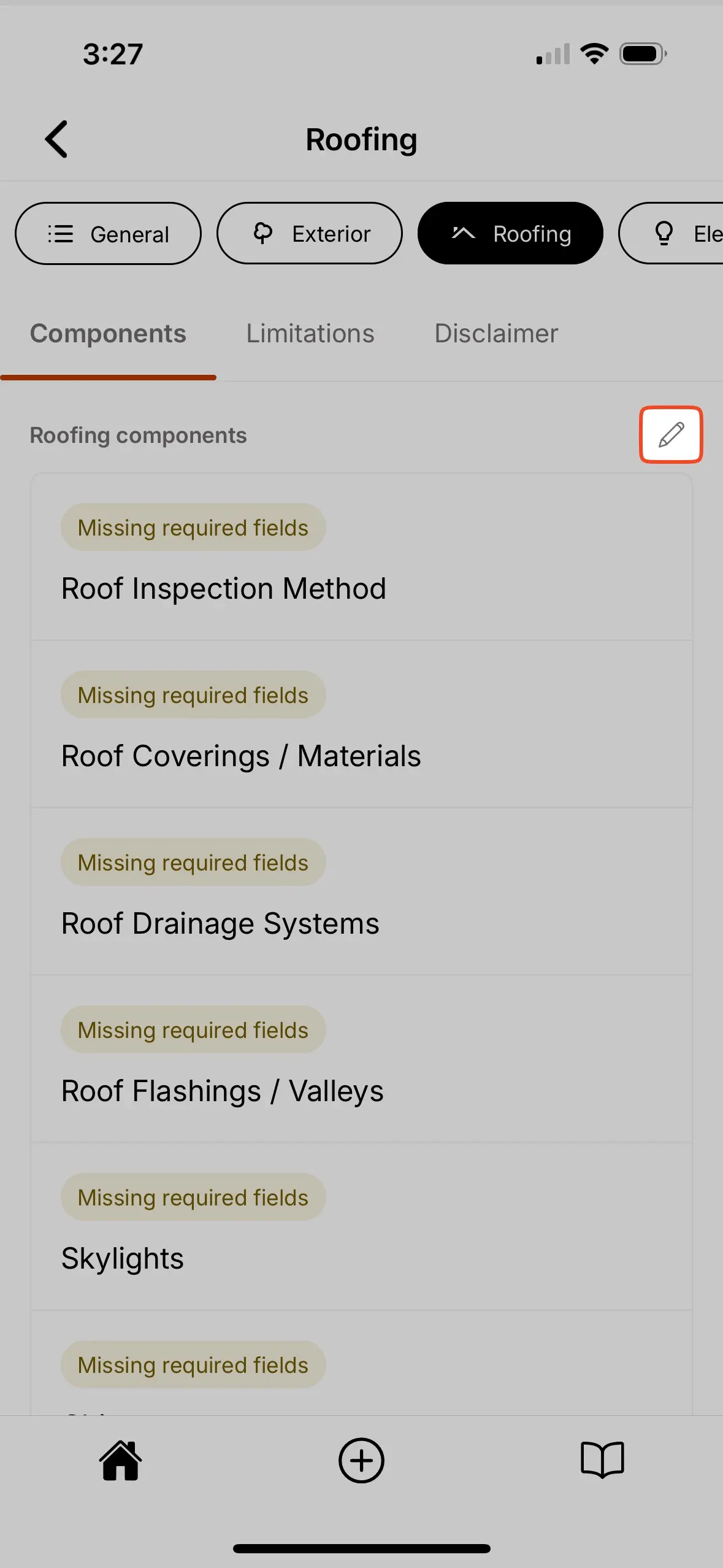
When creating a new component you have the option to Create blank component or Create from existing component.
Create blank componentmeans there are no fields within the new component.Create from existing componentmeans you can select an existing component and duplicate all of the fields and field options within as a starting point. You can then further customize this duplicated component to suit your needs.
Editing components
To edit existing components:
- Enter the component you would like to edit.
- Update the component name at the top of the page.
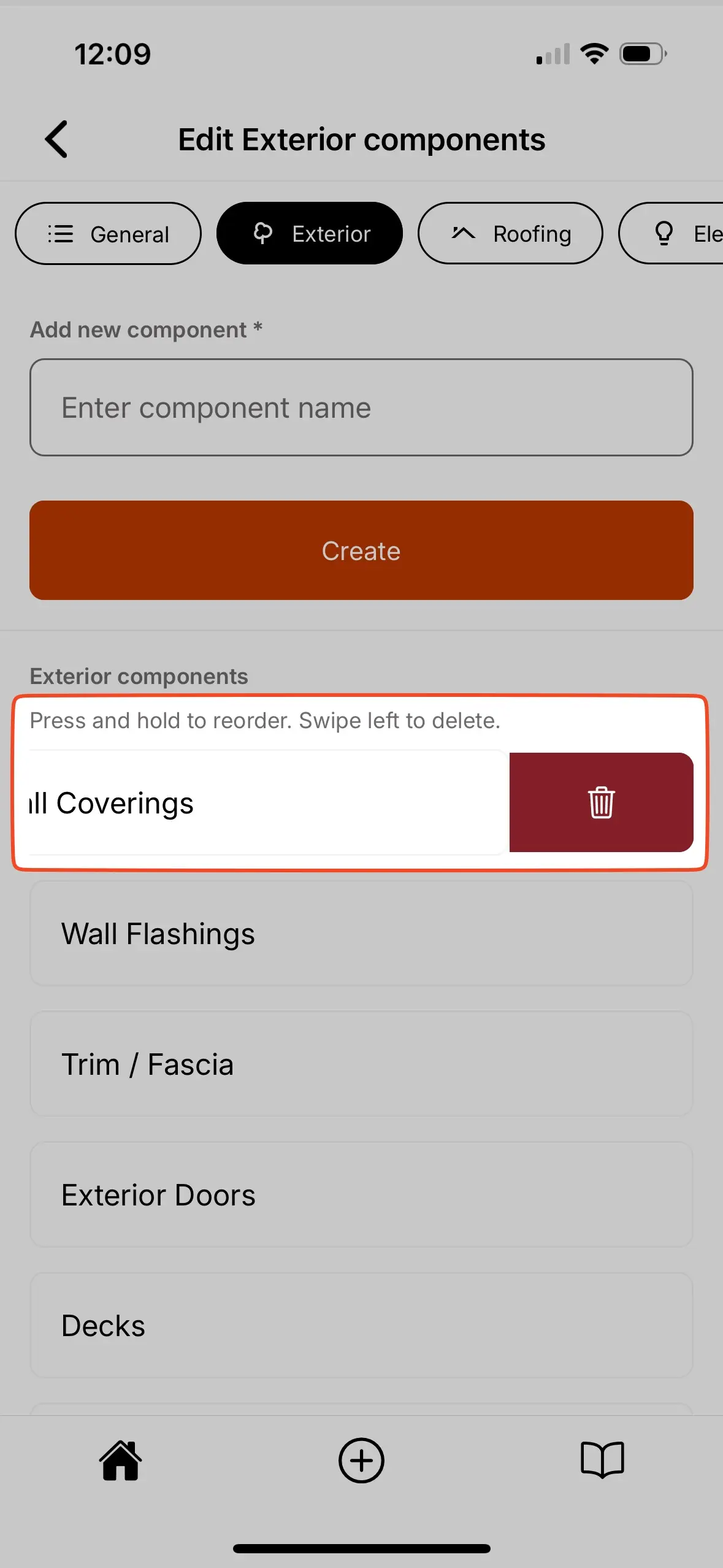
Deleting components
To delete existing components:
- Enter the category in which the component should be deleted.
- Select the edit icon near the top of the component list.
- Locate the component you would like to delete and swipe left.
- Select the trash can icon that appears to delete the component.
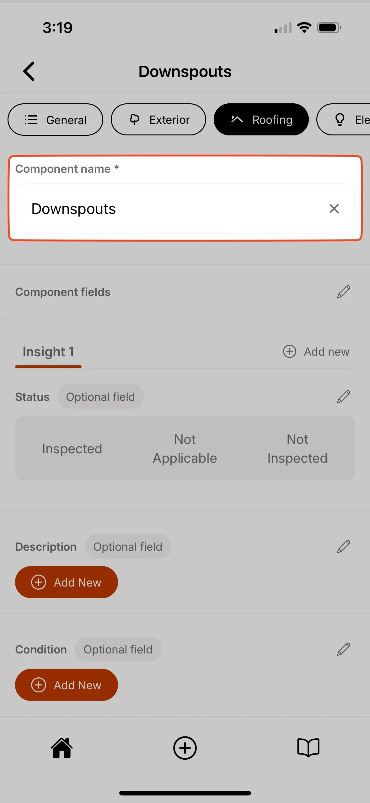
Creating, editing, and deleting fields
The sections below cover creating, editing, and deleting fields.
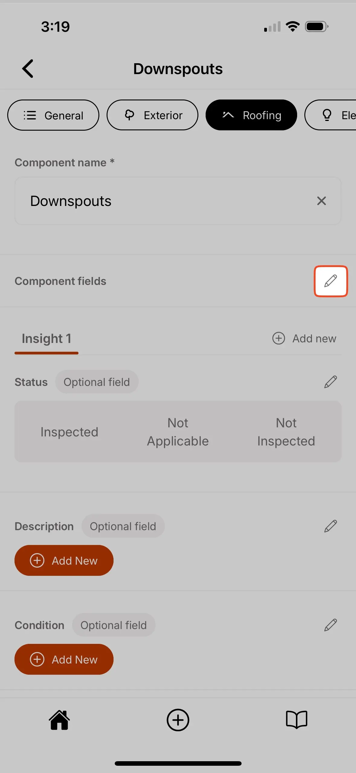
Creating fields
To create new fields:
- Enter the component where the new field should be created.
- Select the edit icon in the
Component fieldssection. - Enter a new
field name. - Select the
field type. - Select
create. - The new field has been successfully created and can be located at the bottom of the field list.
Field types
You can use different types of fields in your Inspection Forms:
- Checkbox – Creates checkboxes for you to select one or more options.
- Choice – Creates radio buttons for you to select a single option.
- Text – For short text descriptions (50 characters max).
- Multi-line Text – For longer text descriptions (1,000 characters max).
- Media – Attach photos/videos.
Each field type lets you capture different types of data for better clarity in your reports.
You can create many fields of the same field type in an individual component.
Editing fields
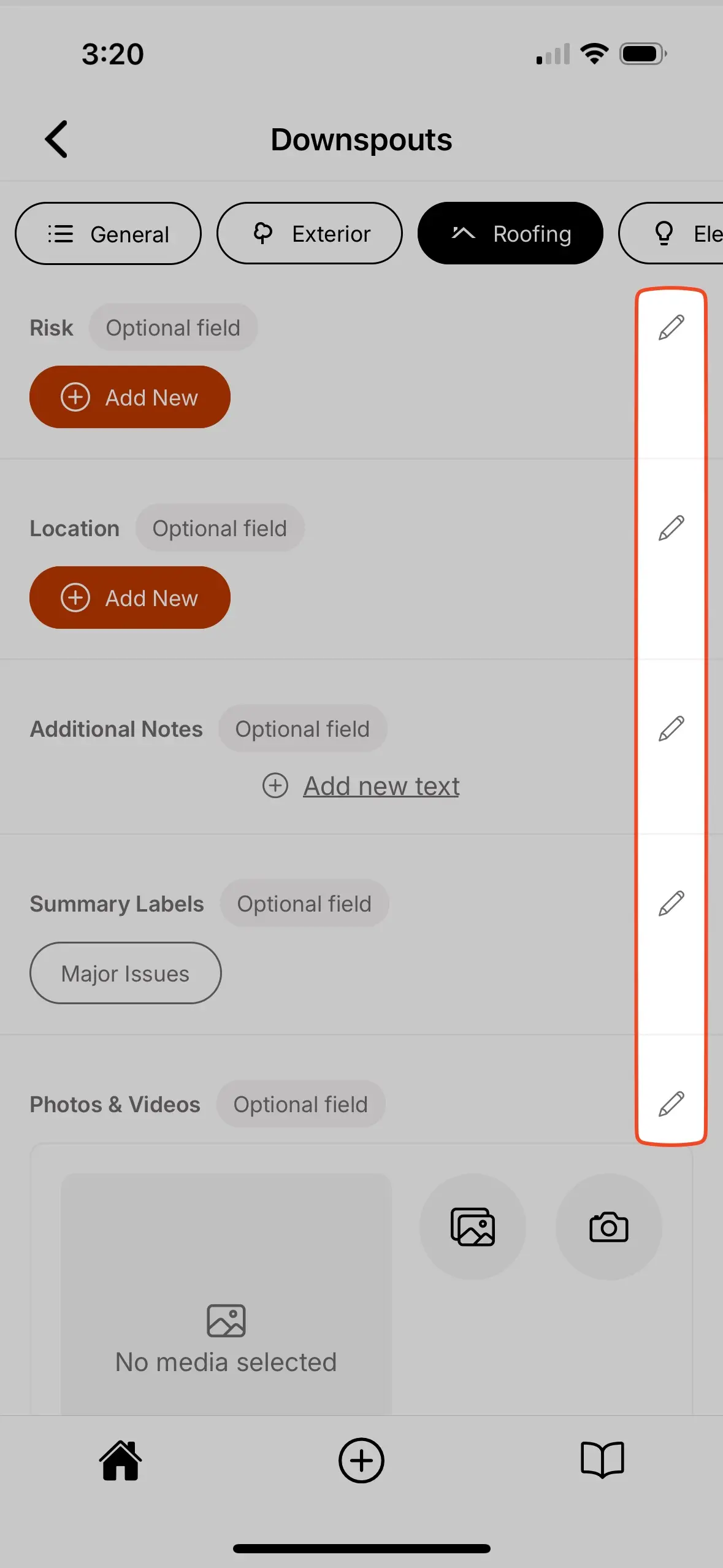
To edit existing fields:
- Enter the component where the field should be edited.
- Select the edit icon next to the field that should be edited.
- Edit the
field name,field requirement,field visibility,favorite optionsandoption library, as desired.

See additional field settings for more details.
Deleting fields
To delete existing fields:
- Enter the component where the field should be deleted.
- Select the edit icon next to the field that should be deleted.
- Scroll to the bottom and select
Delete field.
Creating, editing, and deleting field options
The sections below cover creating, editing, and deleting field options.
Creating field options
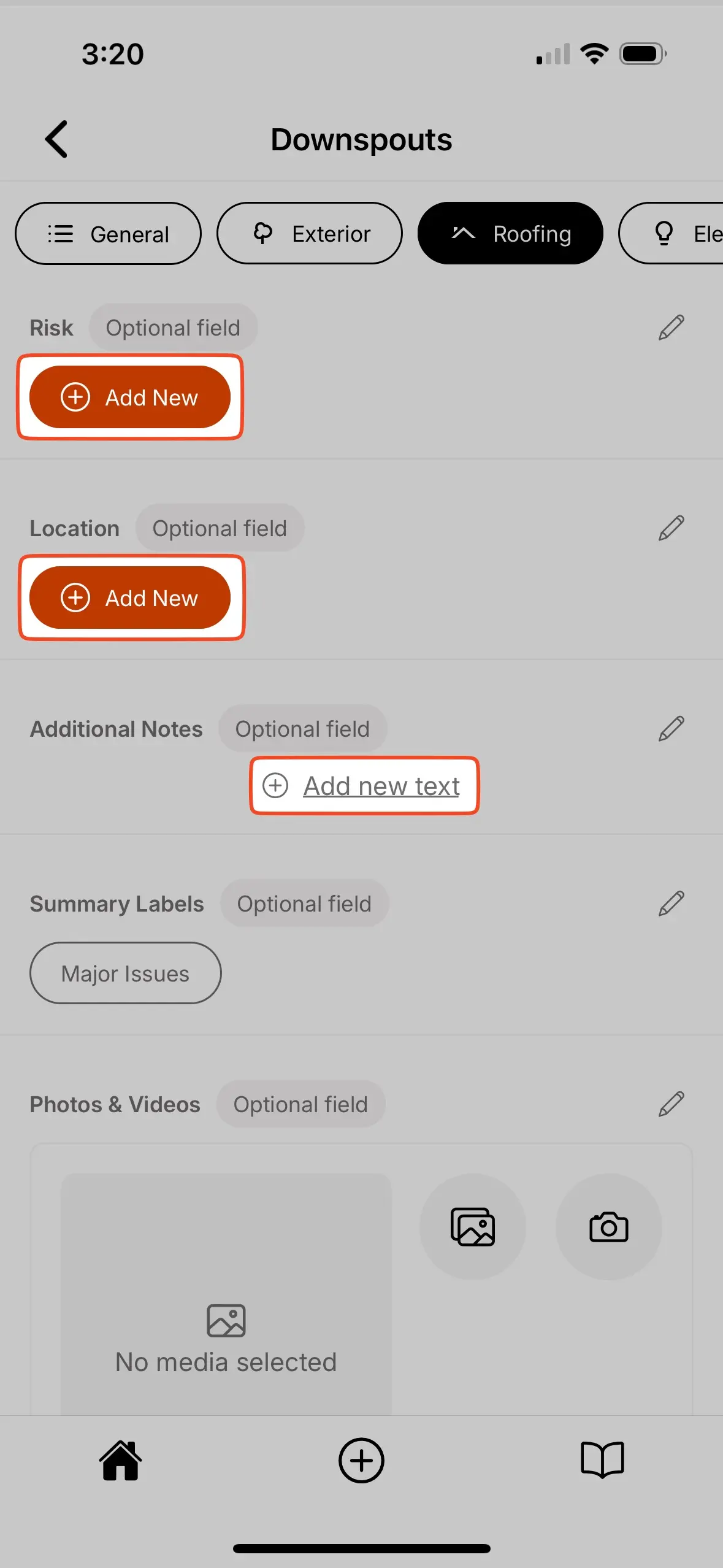
To create new field options:
- Enter the component where you would like to create new field options.
- All fields will have a
Add New,Add new choice,Add new text, orAdd new checkboxoption. Selecting them will allow you to add a new field option.- Alternatively, you could select the edit icon next to the field and in that menu you will also be able to create new field options.
Editing field options
To edit existing field options:
- Enter the component where you would like to edit field options.
- Select the edit icon next to the field which contains the field options that should be edited.
- Review and edit the field options.
Deleting field options
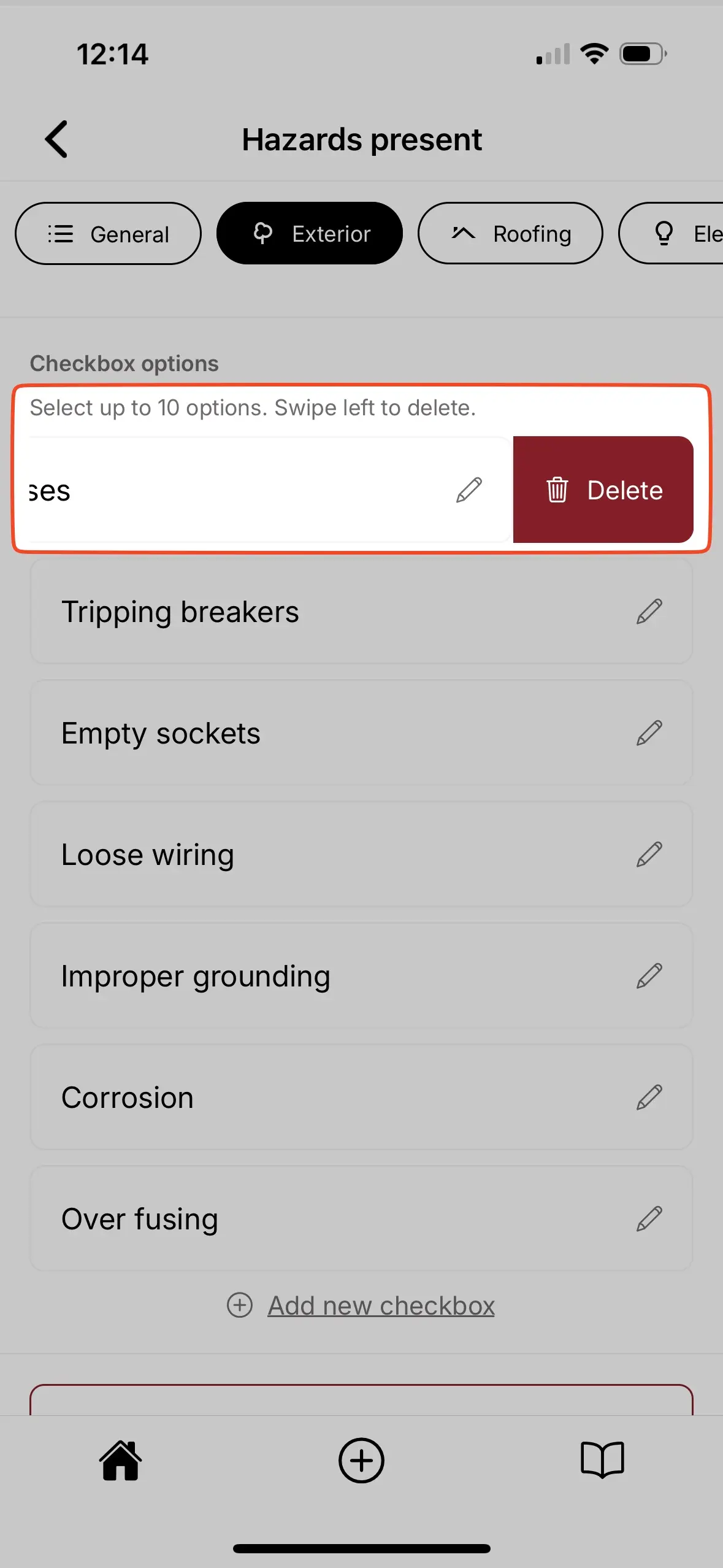
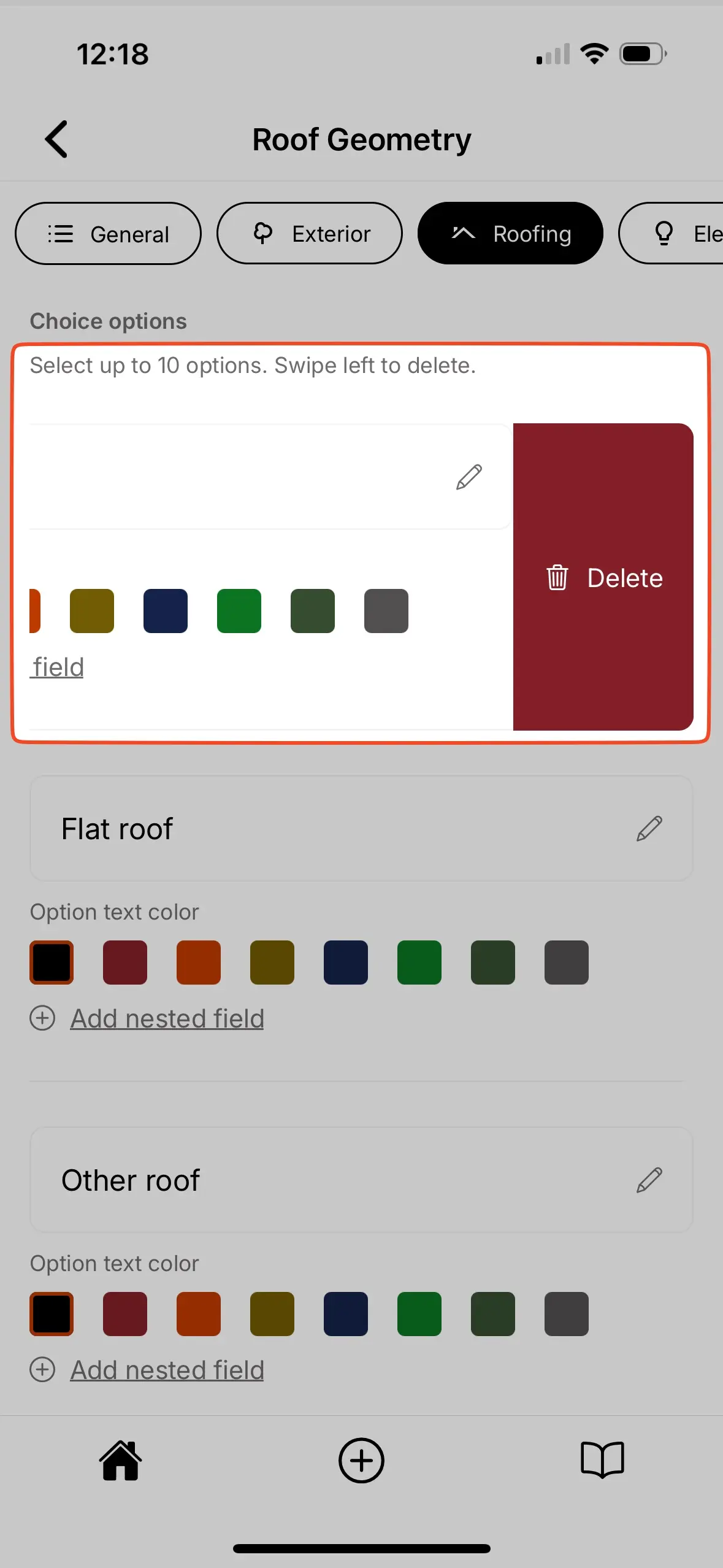
The method to deleting existing field options is determined by the field type.
- Checkbox
- Choice
- Text
- Multi-line text
- Media
- Enter the component where you would like to delete checkbox options.
- Select the edit icon next to the field which contains the checkbox options that should be deleted.
- Locate the list of checkbox options.
- Swipe left on the checkbox option that should be deleted.
- Select
Delete.
- Enter the component where you would like to delete choice options.
- Select the edit icon next to the field which contains the choice options that should be deleted.
- Locate the list of choice options.
- Swipe left on the choice option that should be deleted.
- Select
Delete.
- Enter the component where you would like to delete field options.
- Select the edit icon next to the field which contains the field options that should be deleted.
- Locate the option library.
- Select the trash can icon next to the option that should be deleted.
- Enter the component where you would like to delete field options.
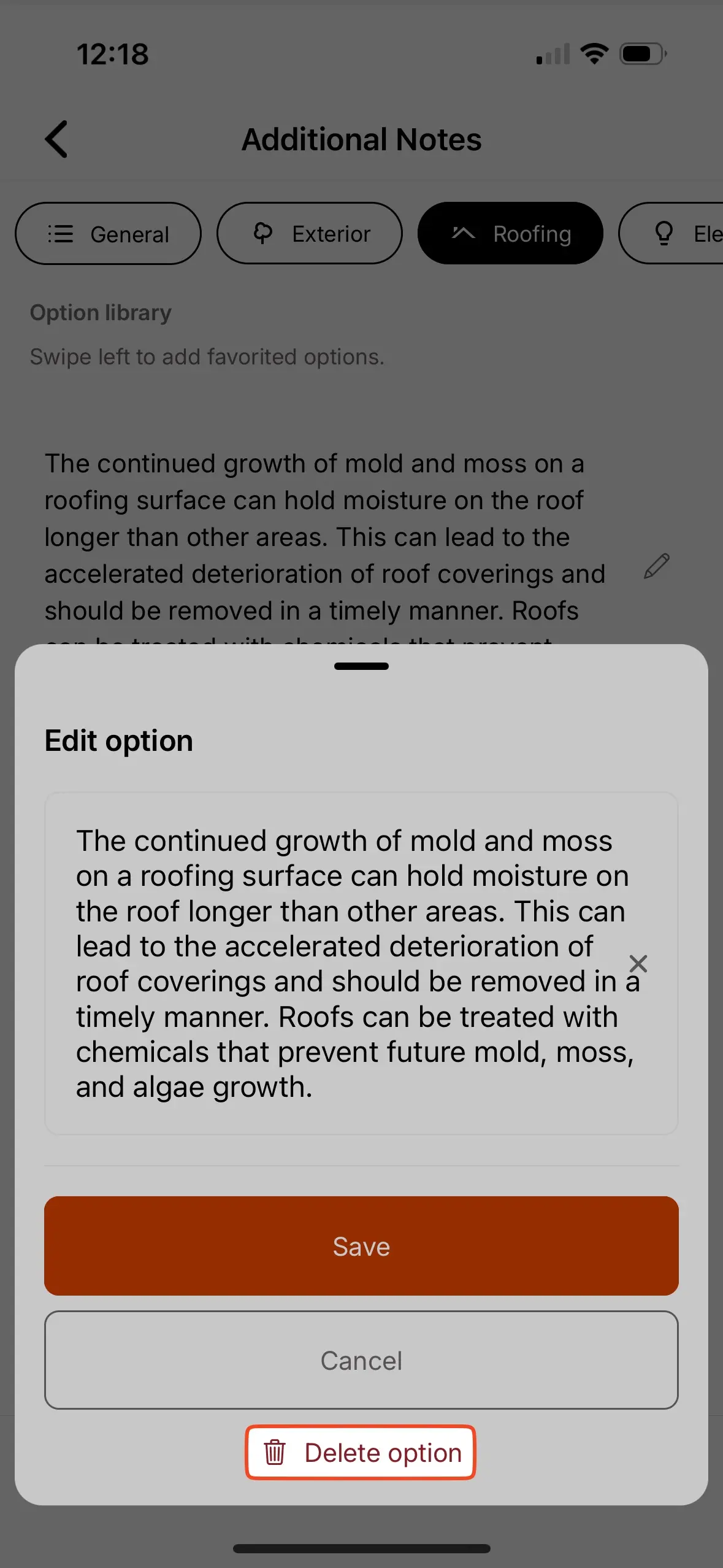
- Select the edit icon next to the field which contains the field options that should be deleted.
- Locate the option library.
- Select the edit icon next to the field option that should be deleted.
- Select
Delete option.
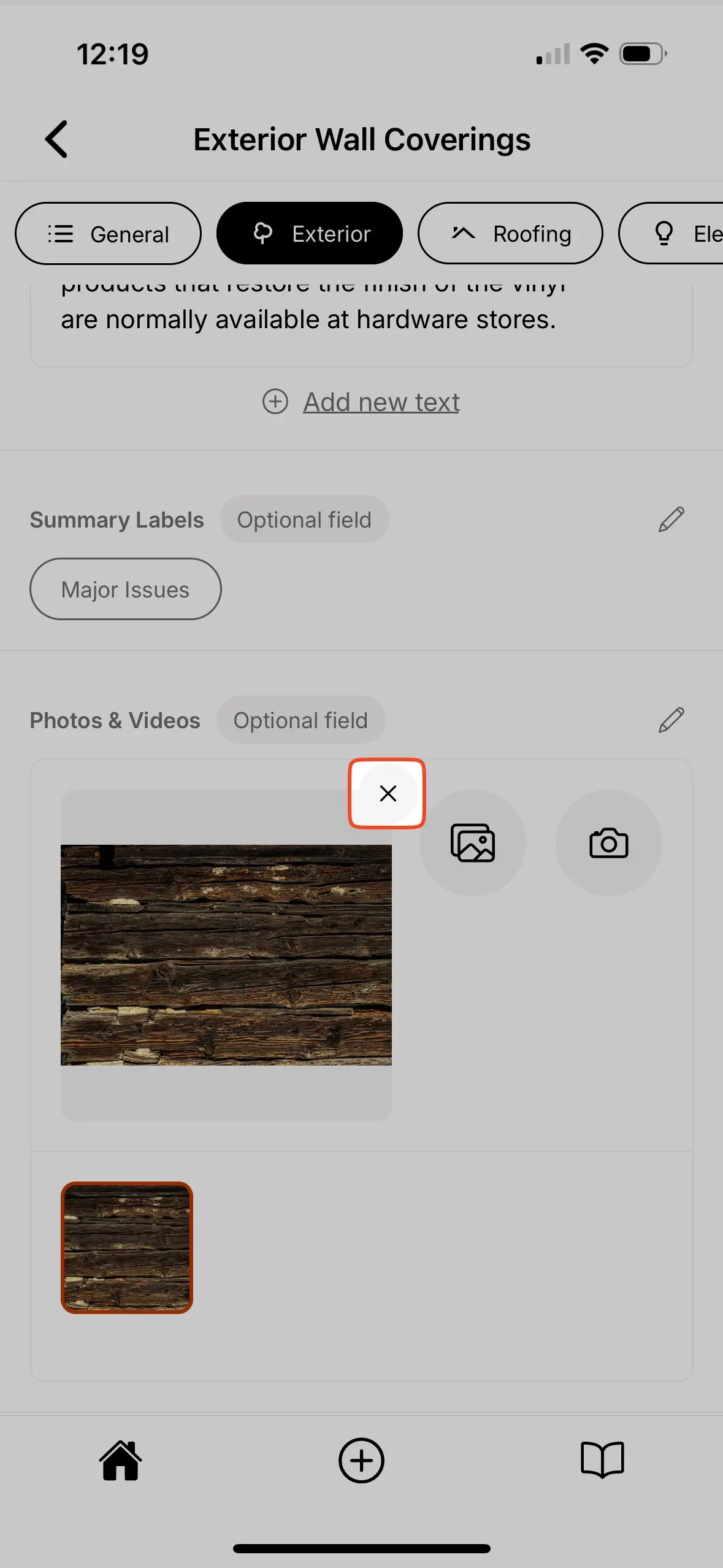
- Enter the component where you would like to delete the media files.
- Locate the media field.
- Select the photo you would like to delete from the photo gallery.
- Select the
Xicon in the upper right corner of the main photo preview.
Adding photos and videos
Attach visual documentation to your Inspection Forms using media fields. Photos and videos help illustrate your findings and provide clear evidence for your clients.
You can add them from your media library or capture new ones directly in the Eneris app.
Supported file types
The media field supports the following file formats:
- Images – JPEG (.jpeg, .jpg), PNG (.png), HEIC (.heic), HEIF (.heif)
- Videos – MP4 (.mp4), MOV (.mov)
These formats ensure your media displays correctly in the final report.
Photo markup
Add visual annotations directly to your inspection photos to highlight specific areas of concern or provide additional context for your clients.
The photo markup feature helps you:
- Draw attention to defects – Circle cracks, highlight water damage, or point out specific issues.
- Add clarity – Use arrows, shapes, and drawing to make your findings unmistakable.
- Professional presentation – Marked-up photos appear in your final PDF report with annotations intact.
Photo markup helps your clients quickly understand exactly what you're pointing out in each photo — reducing confusion and follow-up questions.
Accessing photo markup
To add annotations to a photo:
- Navigate to the component where you want to add an annotated photo.
- Locate the media field.
- Take a new photo or select an existing photo from your device.
- Once the photo appears, select it to open the photo markup interface.
- Use the annotation tools to mark up the photo.
- Select
Saveto apply your annotations.
Photo markup replaces the original photo with the annotated version. Make sure your annotations are accurate before saving, as the original unmarked photo will not be preserved.
Available annotation tools
The photo markup interface provides several tools to help you annotate photos effectively:
- Pen tool – Draw freehand lines to circle areas, underline text, or sketch annotations.
- Shapes – Add pre-defined shapes to highlight specific areas:
- Arrow – Point to specific defects or areas of concern.
- Circle – Highlight round areas or encircle multiple items.
- Rectangle – Box in rectangular areas or sections.
- Oval – Highlight oval-shaped areas.
- Star – Mark priority items or call attention to critical findings.
- Color picker – Choose from multiple colors to differentiate between different types of issues or to ensure annotations are visible against the photo background.
- Line width – Adjust the thickness of your pen strokes and shape outlines for better visibility.
- Photo rotation – Rotate photos to correct their orientation, ensuring images appear upright and properly aligned in your final report.
- Undo – Revert your last annotation action, allowing you to correct mistakes one step at a time.
- Clear – Remove all annotations from the photo at once, letting you start fresh if needed.
Use contrasting colors for your annotations to ensure they stand out clearly against the photo background.
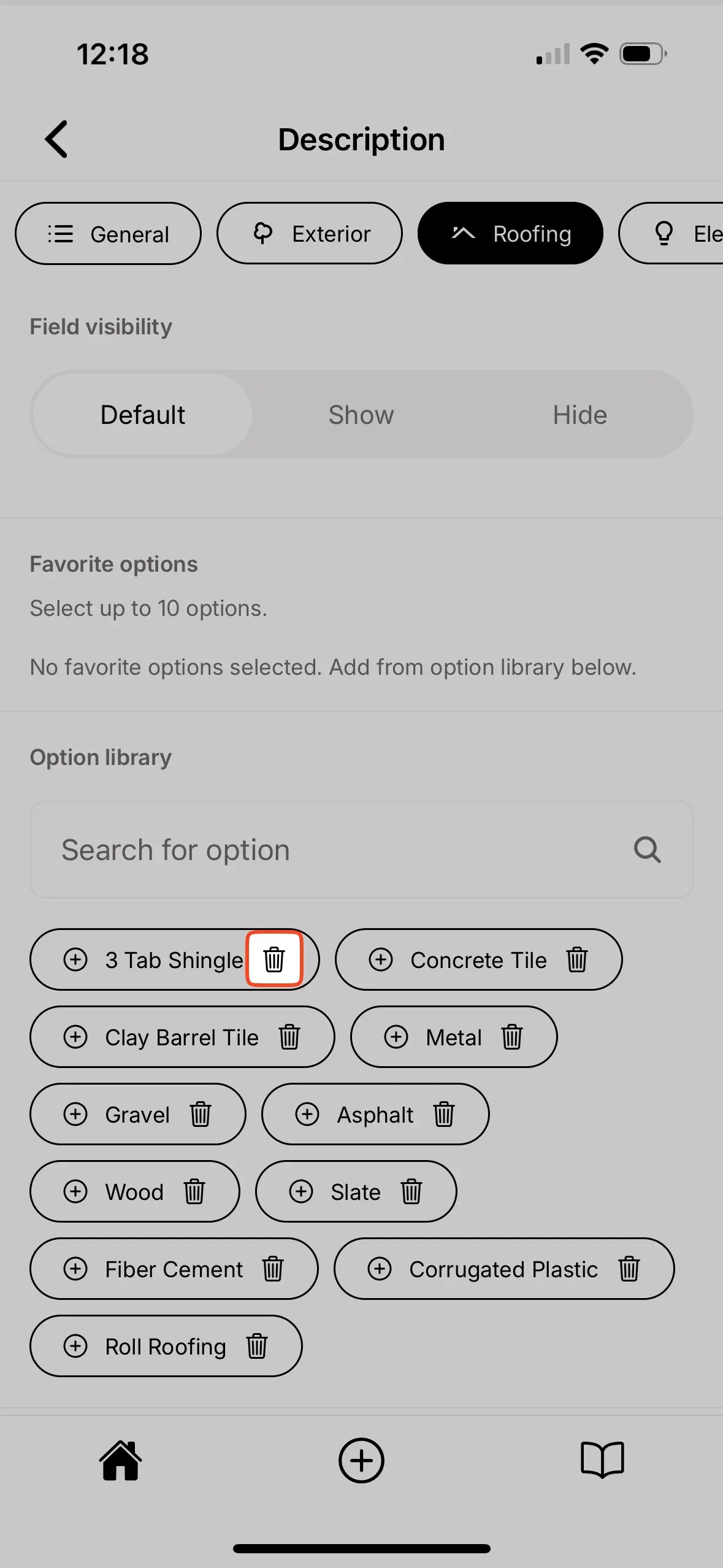
Additional field settings
In addition to the field name and field type there are a number of settings to help you customize your Inspection Form.
Field requirement
A field can be toggled as required or optional.
- Required — When selected, the component list page will provide a visual indicator stating
Missing required fields. This helps you quickly assess whether any component inspection was missed.- When all required fields within a component are completed the visual indicator will automatically update to
Completed fields.
- When all required fields within a component are completed the visual indicator will automatically update to
- Optional — When selected, the field is optional in your inspection.
- By default, all fields are set as optional.
The field requirement toggle helps ensure required components and their fields are completed in a consistent manner.
In templates created by Eneris, the fields that are required are based on the relevant association’s Standards of Practice.
Field visibility
A field can be toggled as show or hide.
- Show — When selected, the field will appear in the final report.
- By default, all fields are set as show.
- Hide — When selected, the field will not appear in the final report. The entries into this field are only visible within the Inspection.
- This is helpful for internal notes, personal reminders, or communication between team members when inspecting a specific component.
- e.g., Your Form Template includes two hidden fields in the Garage Doors component. The first is a checklist field to confirm whether the garage door is closed after inspection. The second is a media field for you to take photo proof the garage door is closed. Neither of these fields will appear in the final report as they are hidden.
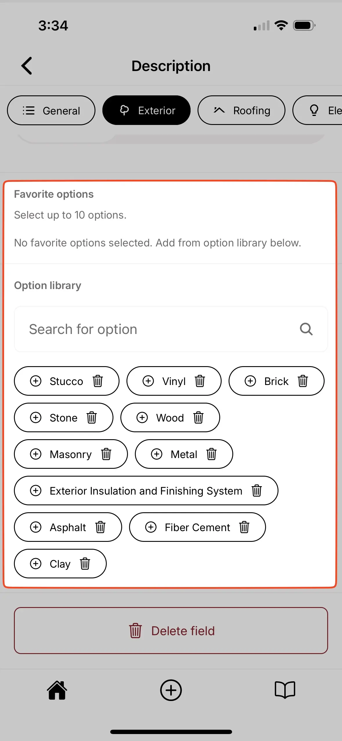
Favorite options
Both text and multi-line text field types allow you to select up to 10 favorite field options from the option library.
- Text fields — When a field option is selected as a favorite, it will appear next to the
Add Newbutton for easy selection when inspecting the component.- Add favorites by selecting the
+icon next to the field option in the option library.
- Add favorites by selecting the
- Multi-line text fields — When a field option is selected as a favorite, it will appear below the text box when you select
Add new textin the field entry.- Add favorites by swiping left and selecting the
+ Addicon next tot he field option in the option library.
- Add favorites by swiping left and selecting the
Option library
A list of all saved responses for the field.
Category limitations
In addition to general limitations, you may also add category limitations.
- After entering a category, the top menu bar will have an option for
Limitations. Enter any category-specific inspection limitations here.- e.g., If you are inspecting a roof and part of it is covered in solar panels you may wish to enter that limitation here.
Category disclaimer
Inform your client(s) about category-specific disclaimers from your inspection.
- After entering a category, the top menu bar will have an option for
Disclaimer. Enter any category-specific inspection disclaimer here.- e.g., The Standards of Practice you created, or follow, may have specific disclaimers you should provide to your client(s).